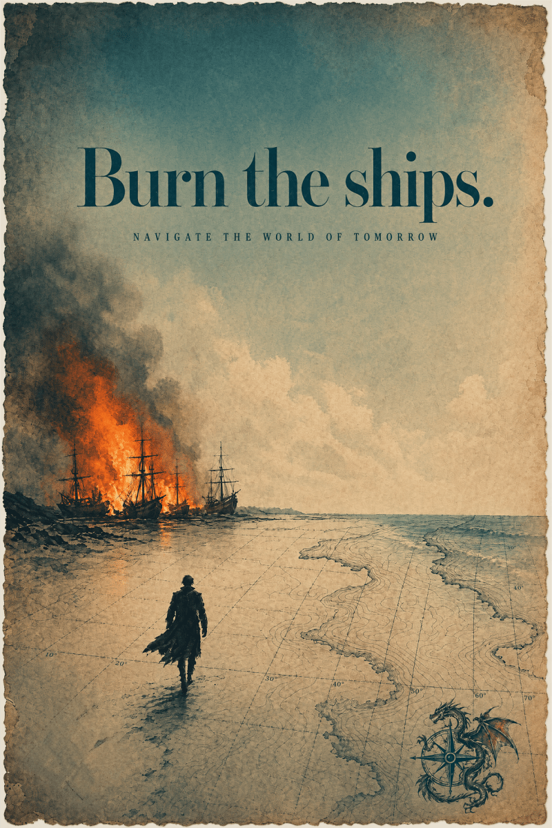
I see UT as an accelerator to throw yourself into the unknown. Going to uncharted territories means leaving the old version of yourself behind (burn the ships) to navigate the world of tomorrow.
These are the entries to the Uncharted Territories design competition, a global search for the best visual depictions of ideas and concepts from the newsletter by Tomas Pueyo.
Browse the entries, like your favorites, and leave a comment to say why.
Congratulations to Igor Brala, winner of the 2026 UT Poster Design Competition.Important Note: Through an internal error, the form was closed to entries for a few days. If your poster is here but without a name, please reach out so it can be correctly attributed.
I see UT as an accelerator to throw yourself into the unknown. Going to uncharted territories means leaving the old version of yourself behind (burn the ships) to navigate the world of tomorrow.
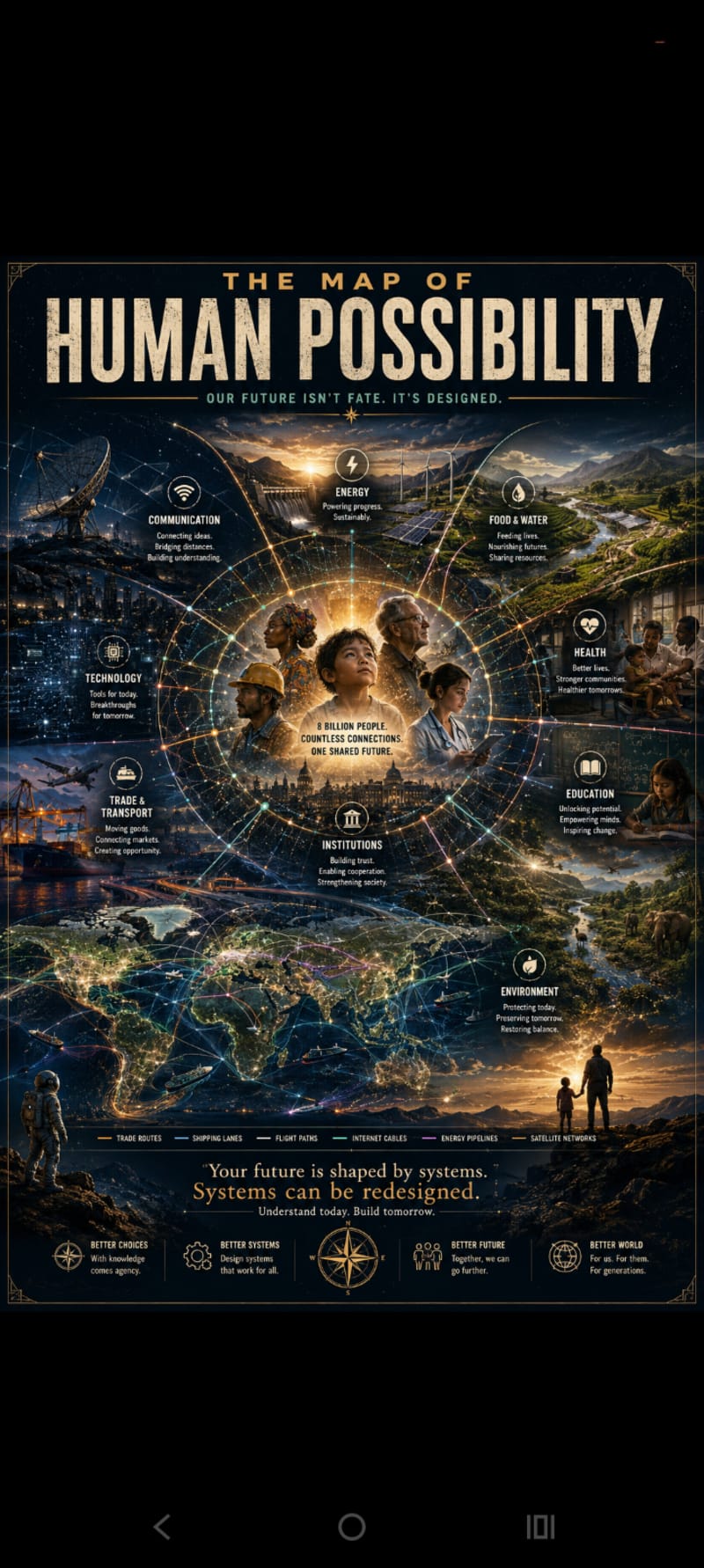
The idea behind this poster is that none of us succeed alone. Every opportunity we have is connected to countless people, systems, and ideas working together across the world.
I was inspired by the themes of Uncharted Territories, technology, trade, education, energy, and human progress. I wanted to create something that people could stare at for a while and keep discovering new details.
The message is simple: where we start in life matters, but it doesn't have to define where we end up. The systems we build shape our future, and those systems can be improved. We're all connected, and that connection is where possibility begins.
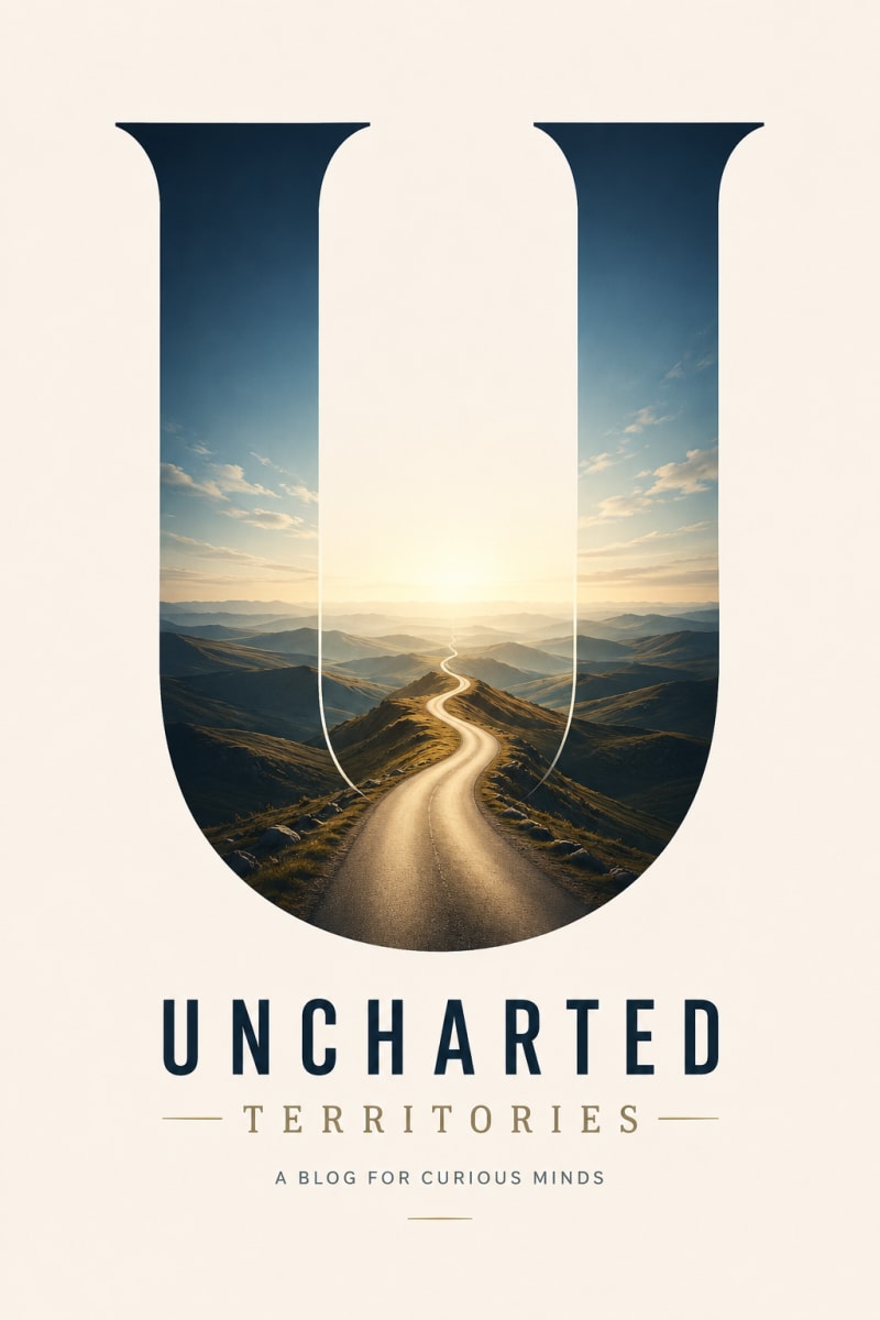
I wanted to represent the boundless character of the human mind, and therefore envisioned the U in Uncharted as the portal into an unknown landscape that leads to infinite knowledge. I wanted the poster to have clean graphics for ease of recognition. And I wanted it to look good. I used AI, of course, to bring it to life.
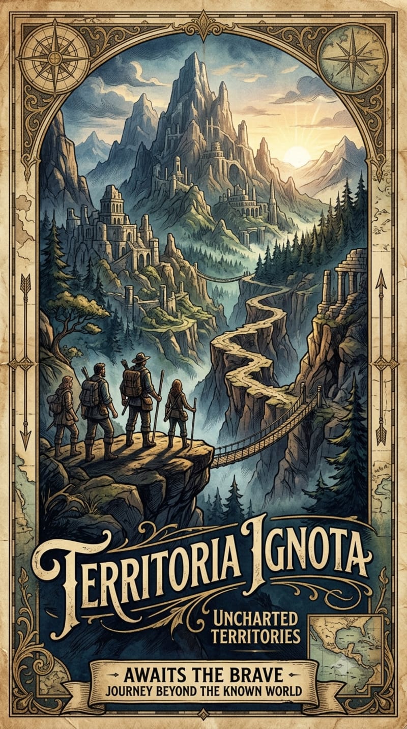
This design is deeply inspired by the core essence of Uncharted Territories—the profound human drive to explore the unknown and the sublime beauty of ancient cartography. The poster visualizes the concept of "Territoria Ignota" (Unknown Lands), drawing directly from historical maritime maps where uncharted regions were filled with mythical topography and the promise of discovery.
I chose to work with a classic, hand-drawn aesthetic, blending intricate border scrollwork, compass roses, and vintage typography to evoke the feeling of an authentic artifact from the Age of Discovery. The focal point features a band of four explorers standing on a precipice, gazing upon a vast, hidden valley of towering peaks, ancient ruins, and a winding path that cuts through the mist. This composition captures the exact moment curiosity meets destiny. The warm, sepia-toned color palette, punctuated by muted greens and blues, was selected to give the artwork a timeless, nostalgic quality. Ultimately, the design serves as a visual metaphor for the Uncharted Territories theme: an invitation to step beyond the edges of the known map and journey into the extraordinary.
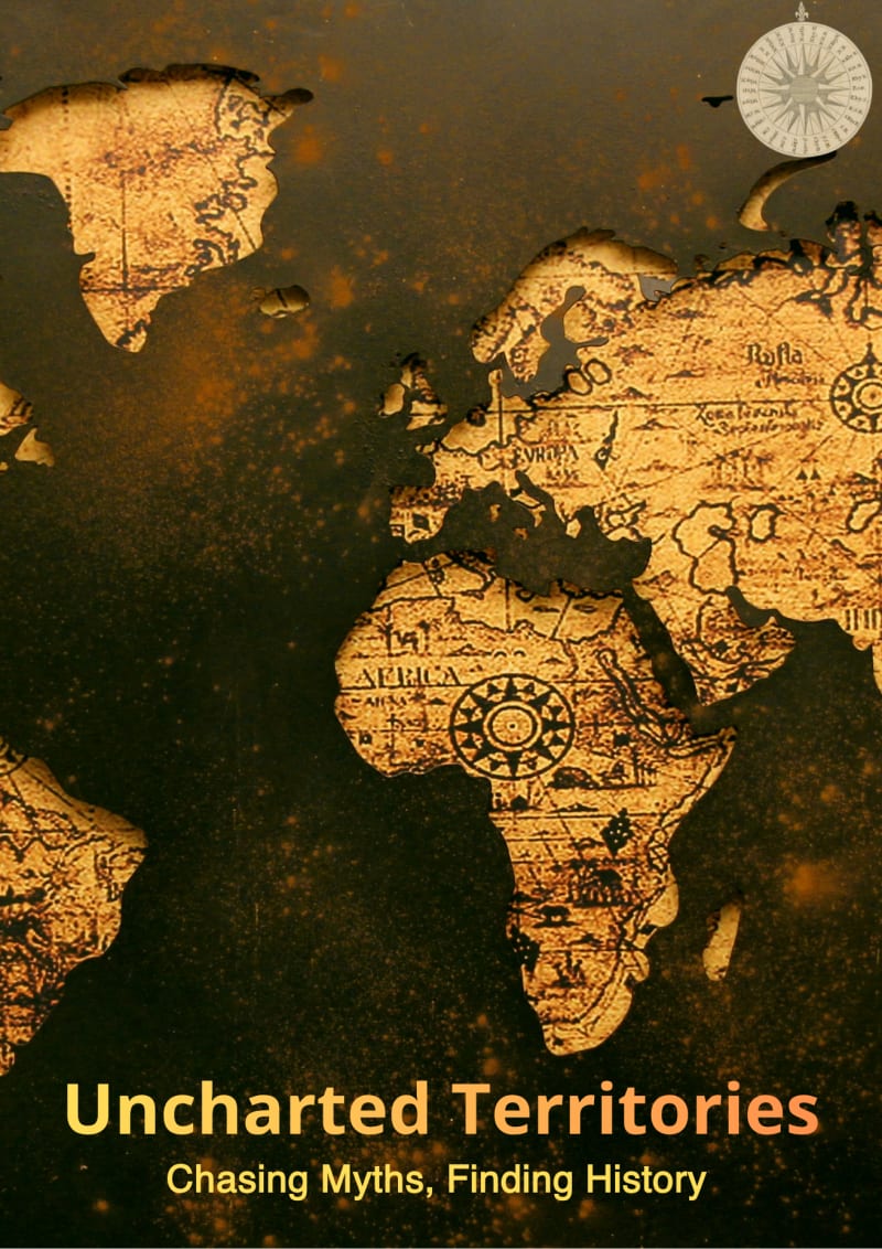
يُجسّد هذا التصميم السينمائي روح الاستكشاف والبحث التاريخي تحت عنوان (Uncharted Territories: Chasing Myths, Finding History)، وهو مستوحى بالكامل من الطابع التحقيقي والعميق لمقالات مجلة UT.
تم اختيار عناصر العمل بعناية لتعكس فكرة المجهول؛ حيث تعتمد الخلفية على خريطة عالم كلاسيكية قديمة مدمجة بدرجات اللونين الذهبي والأسود لإضفاء شعور بالغموض والهيبة التاريخية، مع دمج عنصر البوصلة القديمة كرمز لإرشاد المستكشفين وراء الأساطير المنسية. تم تنسيق الخطوط وتوزيعها في الجزء السفلي بدافع تحقيق توازن بصري مريح للعين (Clean Design) يضمن وضوح الفكرة الإعلانية دون تشتيت تفاصيل الخريطة.
الهدف من هذا المفهوم هو إثارة فضول المشاهد وربط الجانب الجغرافي بالعمق القصصي، ليبدو البوستر كغلاف فخم لتوثيق مغامرة البحث عن الحقيقة خلف حدود الخرائط التقليدية
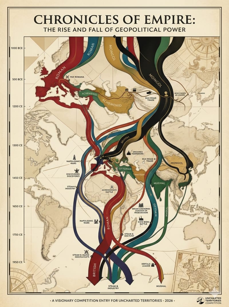
Concept Note: Chronicles of Empire
The Idea
The concept is rooted in Geopolitical Determinism, a core theme of Uncharted Territories that explores how geography shapes human history and power dynamics. The design synthesizes vintage cartography with data visualization, transforming a classic world map into a dynamic, living timeline that illustrates the fluid nature of global hegemony.
The "Why" and UT Inspiration
Inspired by Tomas Pueyo’s deep-dive articles on demographic shifts, geographical chokepoints, and the rise of civilizations, this poster visualizes empires not as static borders, but as flowing rivers of influence. I chose to use Sankey-style flow streams overlaid on historical maps to represent major empires (Roman, Mongol, Ottoman, British) expanding and contracting across a vertical timeline spanning from 1000 BCE to the modern era. Crucial historical turning points—like the Silk Road trade, the Industrial Revolution, and major conflicts—act as physical barriers or accelerators that redirect these streams.
This design was chosen because it embodies the UT philosophy: translating dense, macro-historical data into a striking, high-contrast visual narrative that is both intellectually stimulating and aesthetically fitting for a premium print product.
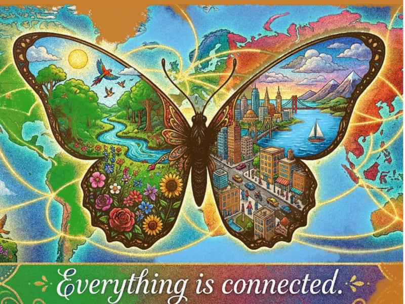
My poster, The Butterfly Effect explores the idea that everything in our world is interconnected. I wanted to create an image that is both visually beautiful and meaningful.
The butterfly represents how small changes can have far-reaching consequences. One side of the wings reflects nature through flowers, forests, rivers, and wildlife, while the other side symbolizes human life and civilization. Together, they show the balance and connection between the natural world and humanity.
I chose this theme because it reflects the spirit of Uncharted Territories, which helps people understand the world through compelling visuals and ideas. My goal was to create a poster that people would enjoy displaying on their walls while encouraging them to think about the invisible connections that shape our planet.
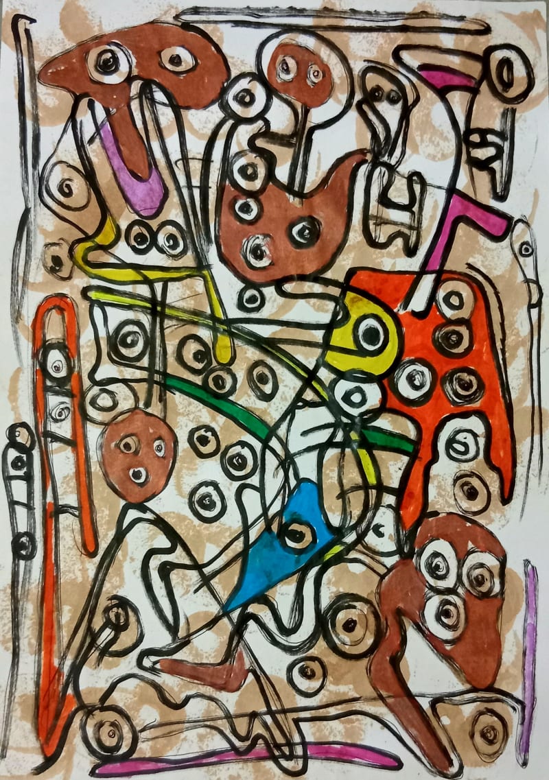
I draw on the traditions of Afro Surrealism, Expressionism and Abstraction to explore a myth, death, dance and chaos. My abstract paintings combine an eclectic range of colours with forms extracted from dreams. I experiment with line colour, movement and dreamy imagery to create a vibrant paintings on paper and canvas that spring to life with vital energy, swirling, curling, and dancing across the canvas, graceful lines take centre stage in my works of varying thought-provoking, non representational art that takes viewers on a quick chaotic journey full of free of association and surprise.
I make an immediate impression with a raw dreamy appearances that conceals a deeper perspective and using enigmatic juxtapositions, and humour to portray the depiction of the absurdity of the real world through the lens of racial and cultural identity.
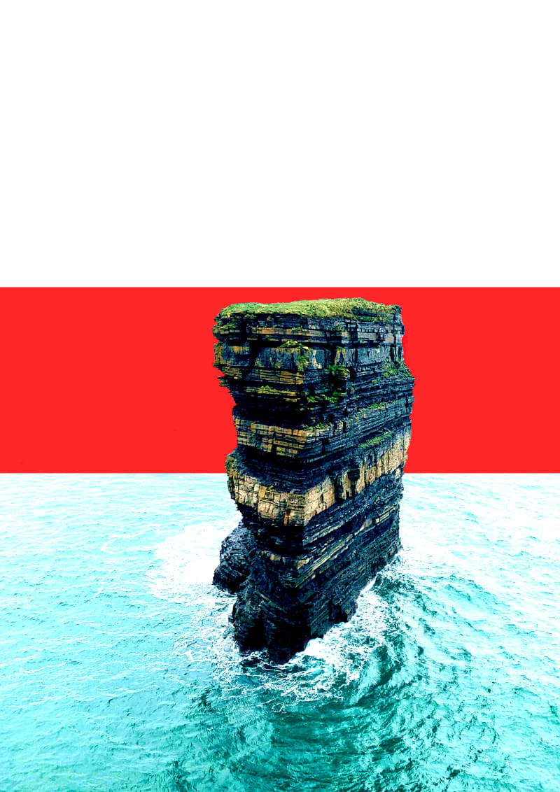
I was inspired by the topic of immigration. In my country, there are a lot of incoming immigrants, especially by sea, with a great amount of danger to their lives on that journey. I wanted to portray that in a collage.
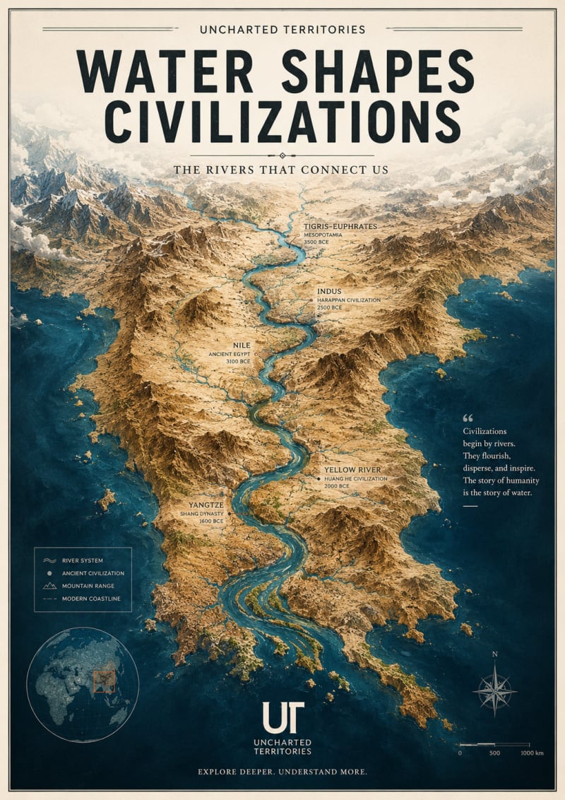
My poster is inspired by one of the core ideas that makes Uncharted Territories unique: geography is not just a backdrop to history it actively shapes human civilization. I chose to visualize the relationship between rivers and the rise of major civilizations because it is a theme that appears across many UT articles and embodies the publication’s ability to reveal hidden patterns in the world.
The design presents a dramatic, map-like landscape where great river systems connect ancient centers of human development. Rather than depicting political borders, it focuses on physical geography—the enduring features that influenced migration, agriculture, trade, and cultural exchange over thousands of years. This perspective aligns with UT’s emphasis on explaining why the world looks the way it does.
Visually, I aimed to create something that functions both as an informative map and as a piece of wall art. The poster combines detailed terrain rendering, editorial typography, and a sense of exploration that reflects the spirit of discovery found throughout Uncharted Territories. It is designed to reward repeated viewing, allowing readers to notice new geographic relationships each time they look at it.
Ultimately, the piece celebrates a timeless UT idea: understanding the landscape helps us understand ourselves.
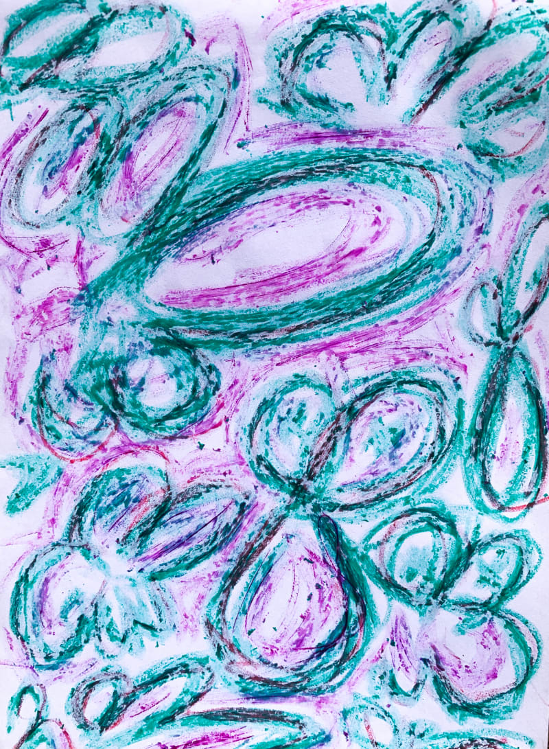
I created this piece during a period in my life when I felt disoriented and uncertain about where I was headed. I didn’t have clarity, but I had the instinct to create. Looking back, I realized that creating wasn’t the result of finding direction it was the process that helped me discover it.
The layered loops, repeated forms, and overlapping marks reflect the feeling of navigating thoughts that don’t yet have a clear destination. They represent movement through uncertainty rather than the absence of it.
What resonated with me about Uncharted Territories is its recurring idea that progress doesn’t begin with having all the answers. It begins by exploring, questioning, and making sense of complexity. That philosophy mirrors my own experience with this artwork.
Rather than illustrating a specific article or chart, this piece is my interpretation of the mindset behind Uncharted Territories: that when we’re faced with the unknown, we don’t wait for certainty—we move through it. We build, we learn, and in the act of creating, we gradually discover our direction.
To me, this artwork is a visual reminder that the map isn’t always something we find. Sometimes, it’s something we create.
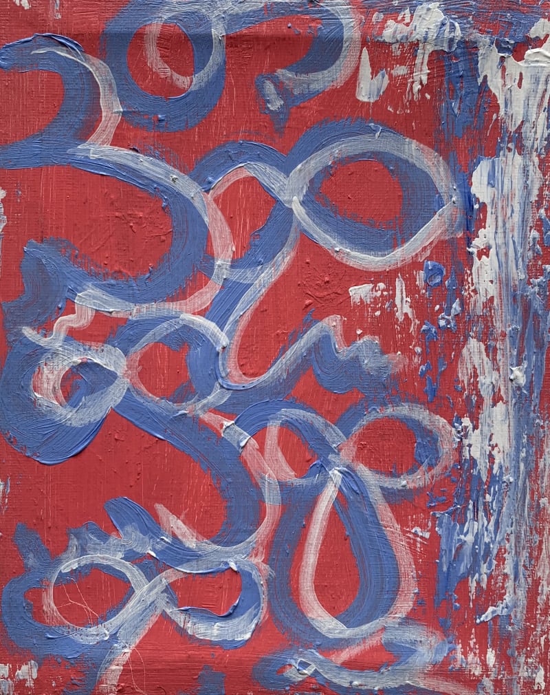
This artwork ‘My Girl’ is a celebration of softness, curiosity, and hope. I used baby pink, blue, and white to create a sense of calm and warmth, inspired by what I see as the gentle strength of a woman.
This piece is my interpretation of that mindset. It reminds us that discovery isn’t only driven by urgency or ambition, it can also be guided by kindness, imagination, and the courage to see beauty in what we haven’t yet understood.
To me, Uncharted Territories is also a reminder that exploration can be gentle. The unknown isn’t only something to conquer it can also be approached with openness, optimism, and wonder.
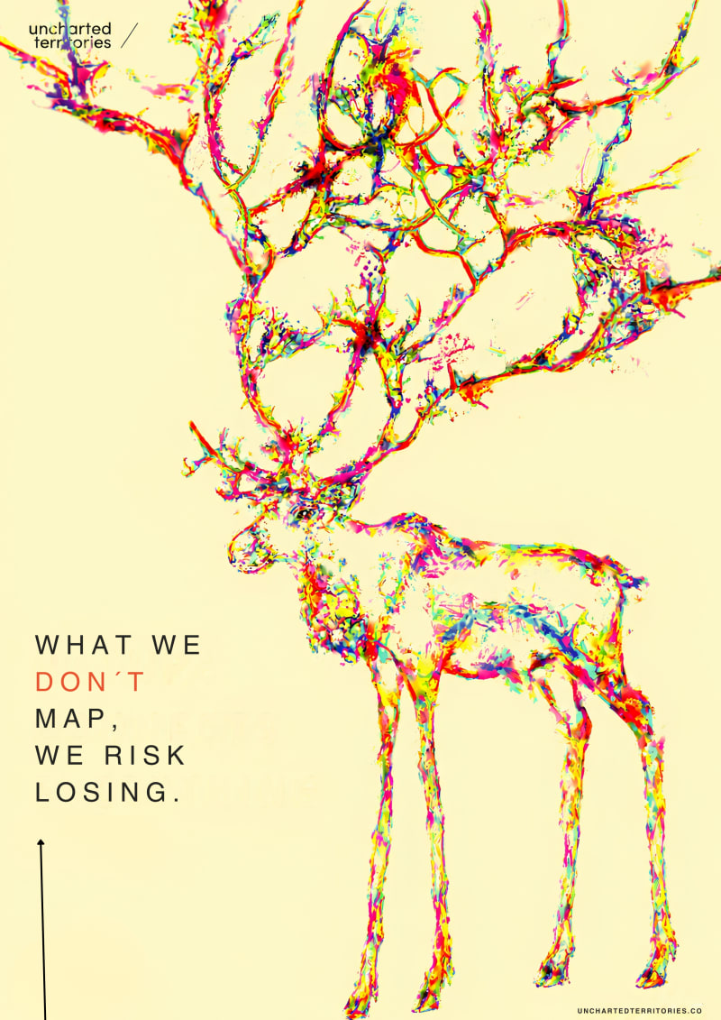
As environmental artist I often use underrepresented biodiversity to translate my artistic vision, this piece was made to portray the migration of Cervidae, using their antlers as traces in a conceptual way, migration often triggered by biological cycles, habitat loss, hunting, and climate change, topics I continually explore and seek opportunities to materialized both within and beyond my country.
This piece was handmade with highlighters, technique I adopted as my signature.
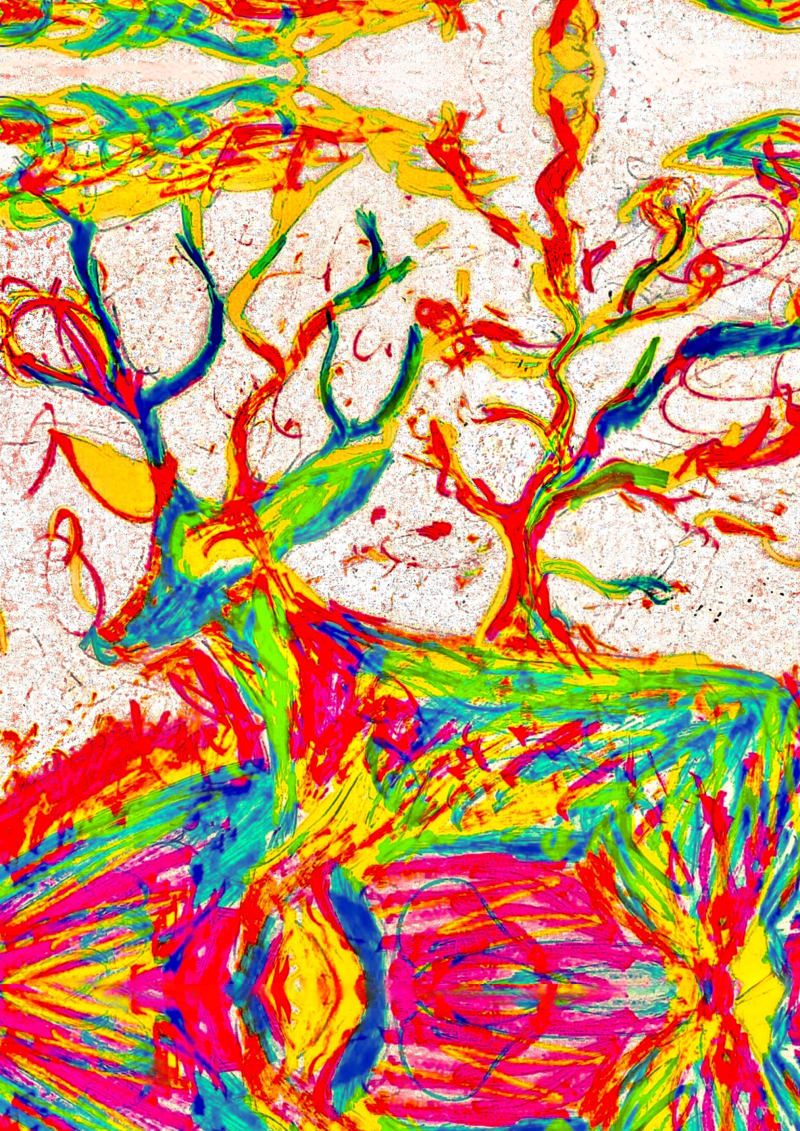
With this proposal, I offer an alternative perspective in which the deer becomes both the traveler and the territory. The work reimagines cartography as a record of movement and wildlife exploration through the visual language of weather maps, merging atmospheric patterns, temperature, and migration into a single artistic landscape.
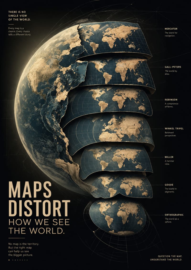
The poster explores the idea that maps are not objective representations of reality—they are interpretations that shape how we perceive the world. Rather than focusing on a single map projection, I imagined the Earth peeling into multiple projections, each revealing a different version of the same planet. This visual transformation symbolizes how every map emphasizes certain perspectives while minimizing others.
The design aims to encourage viewers to question the assumptions behind the maps they use every day. Through layered cartographic forms, dramatic lighting, and minimalist composition, the poster turns a familiar object—the world map—into a metaphor for perception, perspective, and the power of visual storytelling.
Link
https://unchartedterritories.tomaspueyo.com/p/maps-distort-how-we-see-the-world?utm_source=chatgpt.com
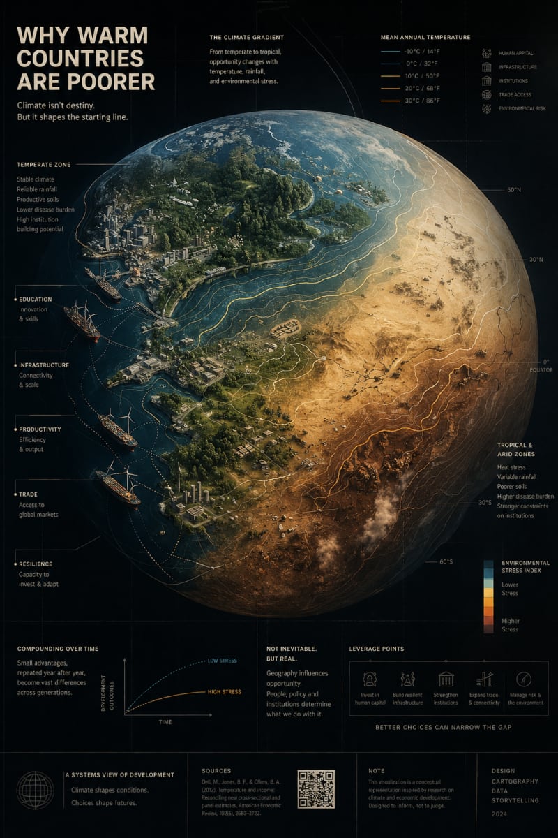
My poster explores how geography and climate can shape long-term patterns of human development. Rather than presenting a simple division between rich and poor regions, the design visualizes a gradual environmental transition, showing how climate, natural conditions, infrastructure, trade, and opportunity become interconnected over time.
I chose this concept because the article challenges viewers to think beyond political borders and consider how geography influences history and economic development. My goal was to transform a complex analytical idea into a single symbolic image that encourages reflection rather than offering a simplistic conclusion. The visual language emphasizes gradients, interconnected systems, and the relationship between environment and human progress, creating a poster that invites curiosity and discussion
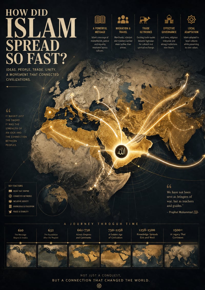
My poster explores the spread of ideas through interconnected human networks rather than focusing on military conquest or political borders. Inspired by the article, I visualized the Arabian Peninsula as the origin of a single pulse of light that expands across the ancient world, gradually connecting cities, trade routes, ports, centers of learning, and cultural exchanges.
I chose this concept because the article highlights that the rapid expansion of Islam cannot be understood through a single factor alone. Geography, commerce, communication, institutions, and the movement of people all played significant roles. My goal was to translate these complex historical processes into a symbolic visual language that emphasizes connectivity, knowledge, and the evolution of civilizations rather than conflict. The result is intended to invite viewers to reflect on how ideas travel and reshape the world over time
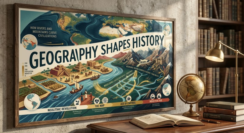
The selection of elements was inspired by concepts taught in prestigious geography departments, such as those at the University of Texas (UT Austin), where the focus is on "the interaction between space and time" and "historical geography." Here are the reasons behind the selection of key elements:
1. Rivers (Source of Life and Stability)
The idea: To choose a river that represents the "cradle of civilizations" (such as the Tigris and Euphrates or the Nile).
Why: In historical and geographical studies, rivers are seen as the engine of the agricultural revolution. I chose them to illustrate how the availability of water led to the transition from nomadic to settled life (the Neolithic Revolution), a fundamental concept in understanding the emergence of organized societies.
2. Mountains (Barriers and Protected Areas) The idea: To portray mountains as elements with dual functions: natural barriers protecting cities, or strategic routes controlling trade and warfare. Why: This reflects research that examines how topography has influenced military defense and political boundaries. History is replete with examples where mountains formed natural borders that prevented invasions or protected certain cultures from disappearing.
3. The Chronological Evolution (From Agriculture to Industry)
The idea: To connect geography with the changing times (agriculture -> empires -> industry).
Why: I wanted to show that "geography" is not static in its influence; in ancient times, rivers were paramount for agriculture, while in the modern era, natural resources and the strategic location of ports determine economic and industrial power.
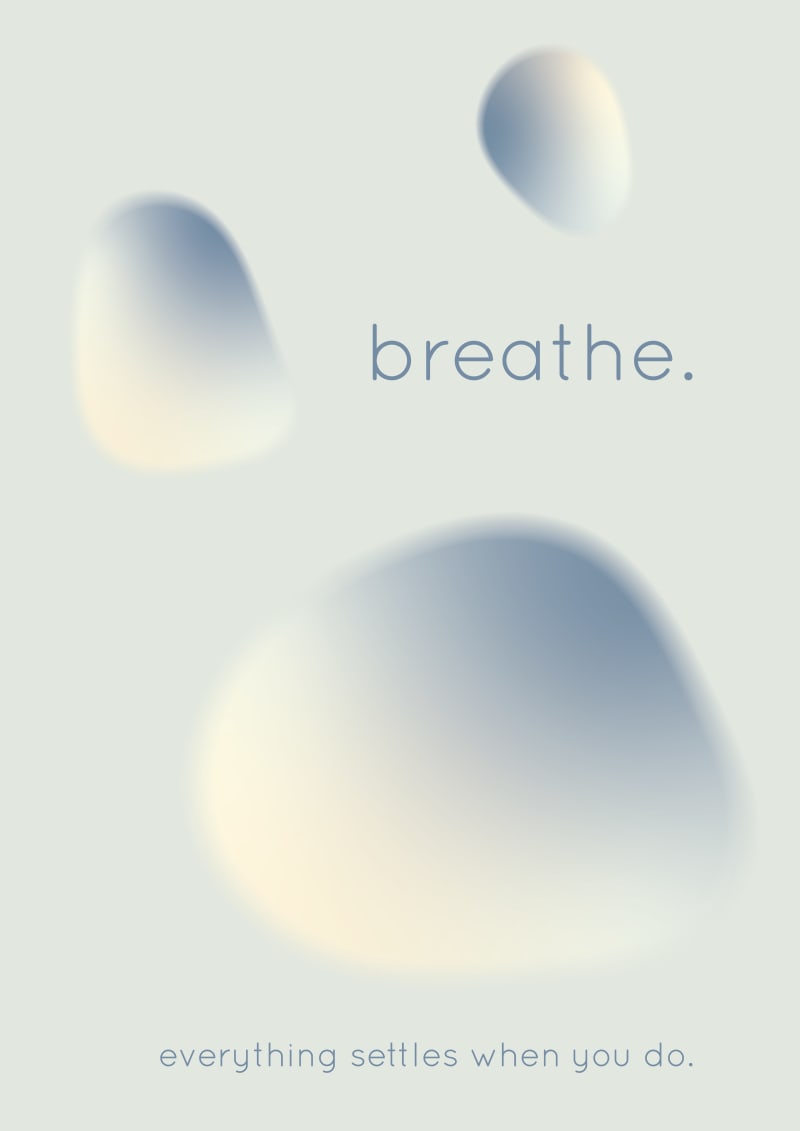
A visual campaign encouraging _x0003_fresh graduates to slow down and _x0003_reconnect with their own pace.
Insight / Problem Statement
Fresh grads struggle to adapt to
fast-paced work environments.
67% of Malaysian employees
report burnout (Employment
Hero, 2024).
Many equate self-worth with
productivity, leading to stress
and time distortion.
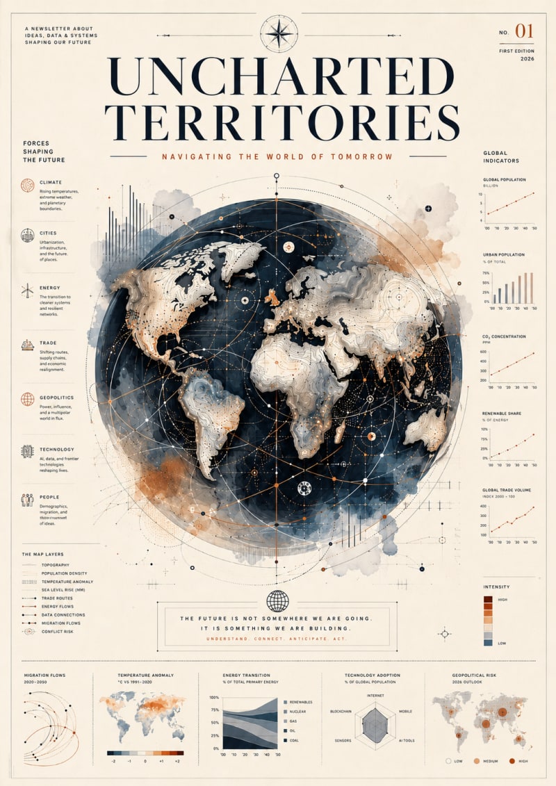
This poster explores the idea that the future is not shaped by one force alone, but by the interaction of many systems operating at the same time. I chose to work with the recurring Uncharted Territories themes of climate, cities, energy, trade, geopolitics, technology, and migration because they reveal how global change is interconnected rather than isolated.
The central globe acts as both a map and a system diagram. Routes, data points, contour lines, and indicators overlap across its surface, suggesting that every shift in one region can create consequences elsewhere. The surrounding charts and visual annotations give the composition the feeling of an atlas, research document, and future forecast combined.
The title “Uncharted Terra” becomes literal: the poster presents the world as something still being mapped, interpreted, and redesigned. My intention was to create a piece that feels analytical from a distance, but rewards closer viewing with layers of detail, uncertainty, and possibility.
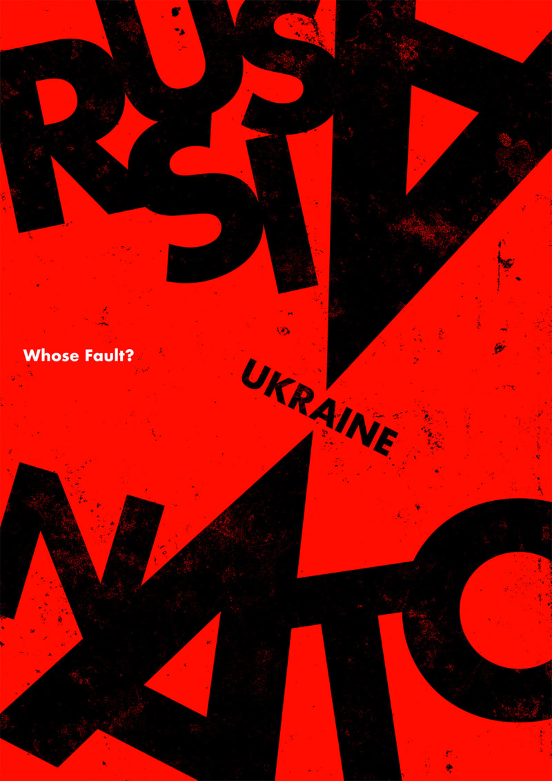
I chose to use only words in my poster to create a sense of tension surrounding the ongoing Russia–Ukraine war. Rather than presenting a definitive viewpoint, I wanted to encourage viewers to pause, reflect, and consider that complex conflicts often have multiple perspectives. I found your articles on the war offered viewpoints that differ from those presented by some mainstream news outlets. Reading a variety of sources can help us examine issues more critically. In an age of constant information, propaganda, misinformation, and bias, maintaining an open, objective, and balanced mindset is more important than ever.
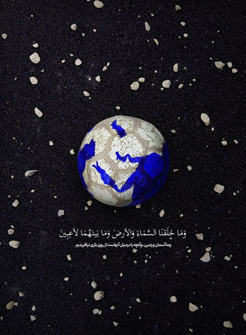
این اثر نشانگر آیه ای از کتاب آسمانی قرآن است که
انجیل و تورات آن را از قبل تایید میکنند که خداوند دنیارا بسیار بزرگ و بی کران آفریده است و برای بازی و هوسرانی نیست و ما باید فکر کنیم در این جهان و برای تکامل خود و جهان تلاش کنیم

Using the title of the blog's entry "OpenAl and the Biggest Threat in the History of Humanity" as a base, this design presents the confrontation of 2 powerful concepts: love and AI. Love as the purest human feeling and AI as an artificial tool that interacts with us humans mimicking our behavior. Interaction with AI can trick us into thinking that we are talking with another human, and arouse feelings that were never meant to exist between a human and a machine. Human love has always been a trip, but the possibility of loving something that cannot love you back, and will always answer whatever you need to hear, is for humanity an Uncharted Territory.
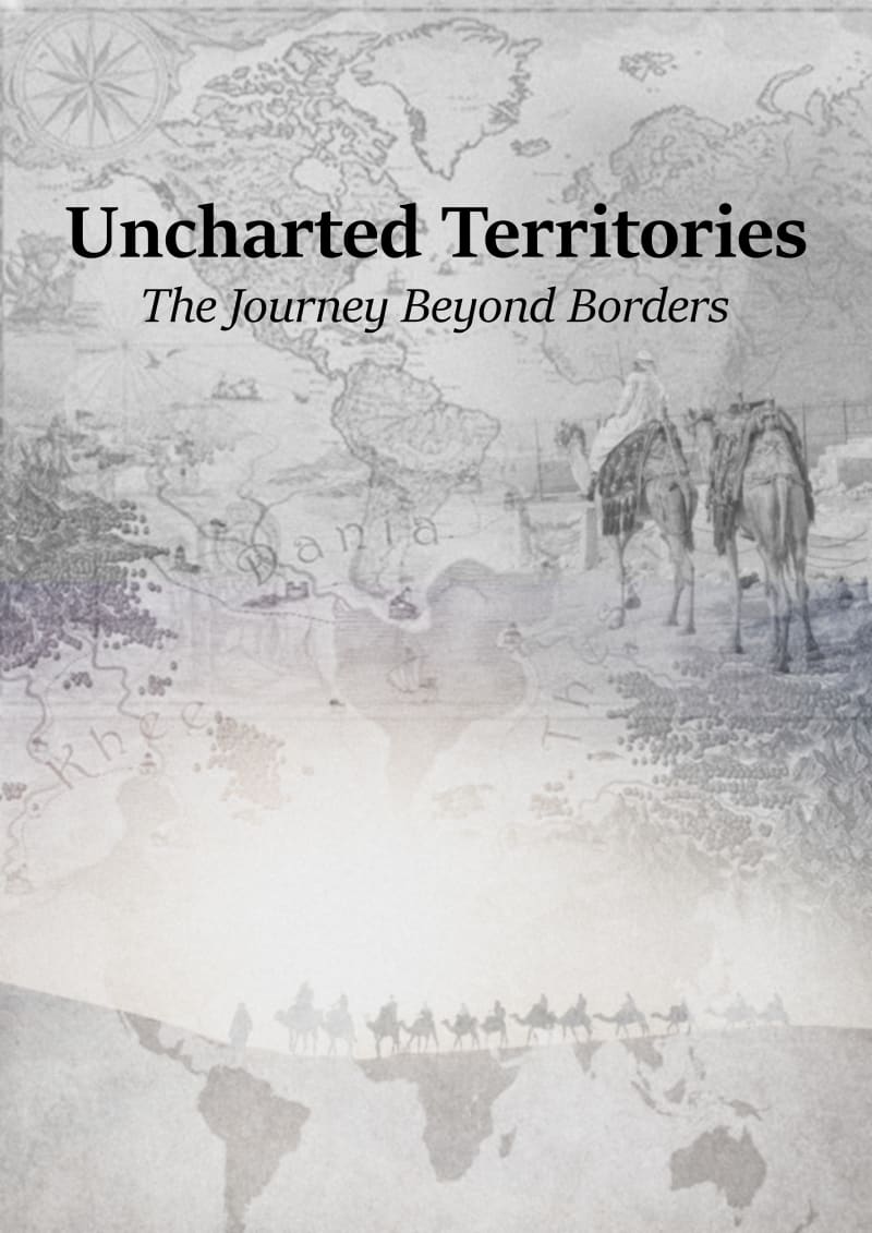
Starting a new business or adventure as a merchant or a business person seeking opportunities in a new place
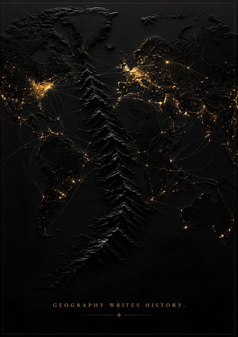
The concept is: The Invisible Wall
This concept was drawn from the article by Tomas Pueyo titled "Why Warm Countries Are Poorer." Geography plays an even bigger role in economic development compared to common belief. Besides considering political and historical factors, the article highlights the fact that the people living close to the equator have chosen to settle in colder mountain regions because of heat, humidity, and diseases that thrive there. Although the highlands provide better conditions, they form physical barriers, making transportation, communication, and trade even harder.
This is portrayed through a minimalistic black relief map, where the mountain ranges stand out prominently through embossing. The gold lights represent human settlements, while the white lines illustrate trade paths, migration, and movement of ideas. However, upon further observation, one notices that the connections are constantly broken by the mountains. No explanatory graphics and texts are required to understand the main message of the article – geography determines the history of civilizations.
"Geography Writes History" emphasizes the fact that the landscape plays an important part in determining opportunities and obstacles that society faces well before any politics and institutions take form. The concept represents the theme of Uncharted Territories by presenting the geopolitical argument visually
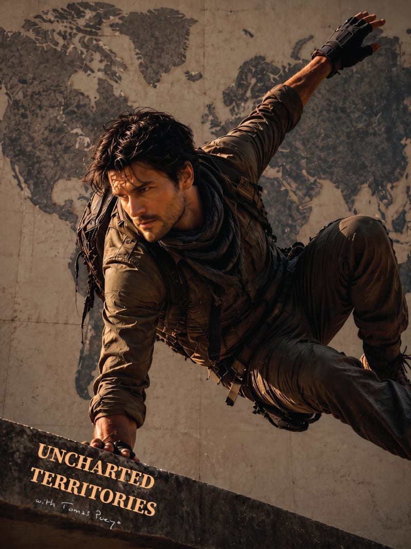
It showcases a lifestyle that encourages readers to be ambitious, stay curious, and explore the world. It serves as a blueprint for living with a spirit of adventure, discovery, and continuous growth.
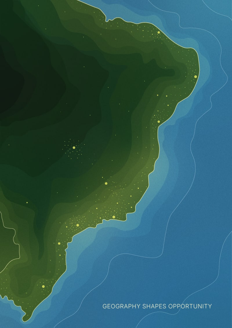
Design is inspired by the UT article "Can Brazil Become a Superpower?". The poster translates one of the article's central ideas into a minimal visual metaphor: geography shapes opportunity. Using an abstract, map-inspired interpretation of Brazil, it explores how the country's landscape has influenced the concentration of people, cities and development along the coast.
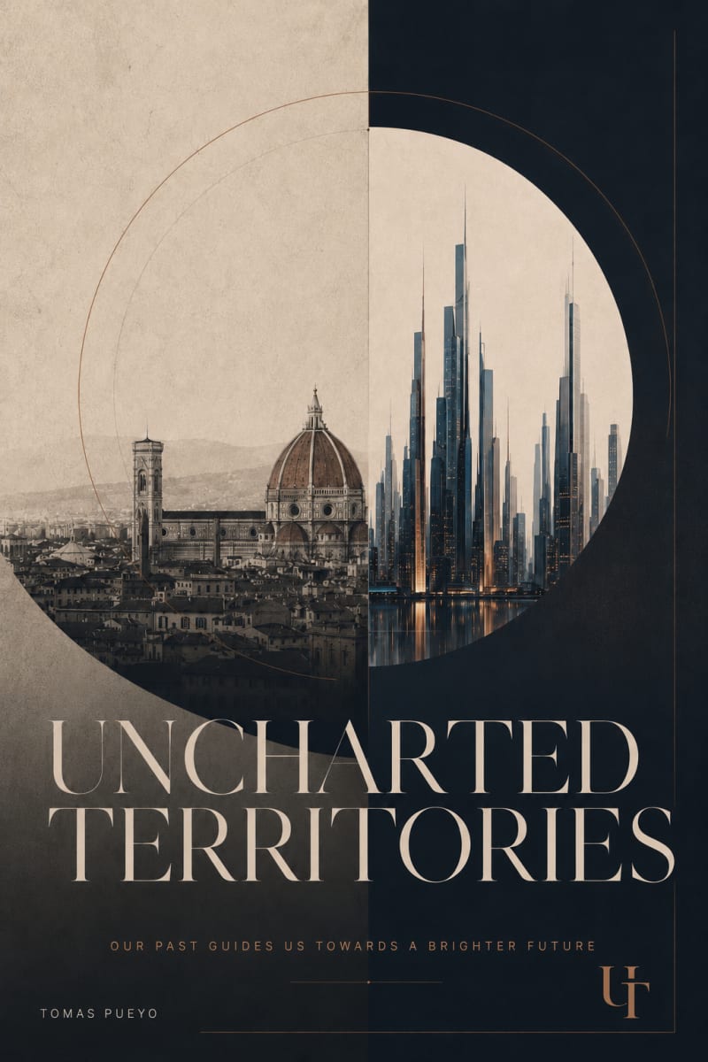
I chose to work with two UT ideas that felt deeply connected: why Florence became the cradle of the Renaissance, and the cold-start problem of new cities.
The design treats the past and the future as part of the same system. Florence represents a place where the right conditions allowed talent, capital, institutions and ideas to compound. The city of the future asks the same question in a new form: how do we deliberately create the conditions for human progress?
Rather than illustrating either article literally, I wanted to capture the broader idea I take from Uncharted Territories: our past can be studied as a map for building a better future.
Hence the line: “Our past guides us towards a brighter future.”
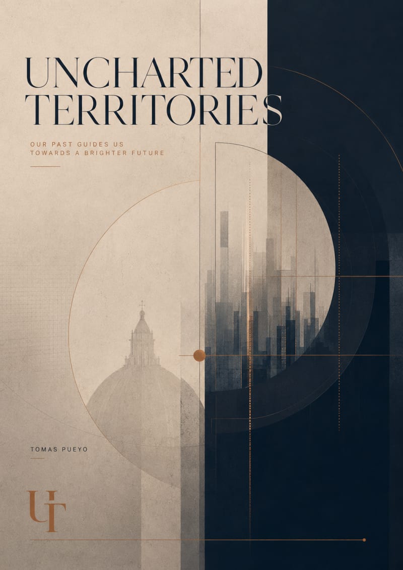
I did a couple of other tries and I liked this one much better
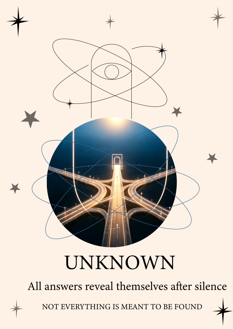
在探索世界未知的领域,我们会有很多的选择,唯独用眼睛认真看,未必是真的,但是静下心来,配合眼睛,就能看透一切。
Translation: When exploring the unknown territories of the world, we have many choices. However, simply looking carefully with our eyes may not reveal the truth. But by calming our minds and using our eyes in conjunction with our own, we can see through everything.
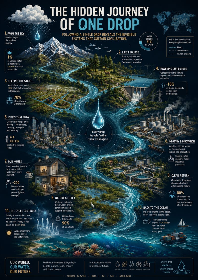
The Hidden Journey of One Drop explores the invisible systems that connect nature, society, and civilization through the path of a single drop of water. Inspired by Uncharted Territories' focus on revealing hidden patterns and interconnected systems, the poster transforms the water cycle into a visual narrative that links mountains, forests, rivers, agriculture, hydropower, cities, industry, homes, wetlands, and the ocean.
Rather than presenting water as a simple natural resource, the design highlights it as the thread that ties together food production, energy generation, ecosystems, economic activity, and everyday life. The flowing river acts as both a geographic map and a storytelling device, encouraging viewers to follow one continuous journey and discover relationships that are often overlooked. The dark, atlas-inspired aesthetic combines cartographic illustration with editorial information design, making the piece suitable both as an educational visualization and as a wall-worthy art print. The central message—"Every drop travels farther than we imagine."—invites viewers to reflect on the hidden networks that sustain our world and the shared responsibility of protecting them.
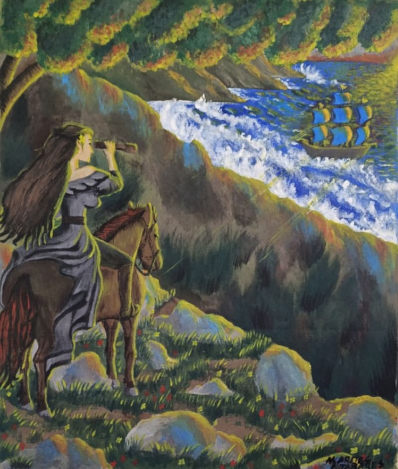
My drawing for the **Uncharted Territories Drawing Competition** explores the moment when two completely different worlds unexpectedly meet. The concept was inspired by the idea of a woman who has lived her entire life in a place that feels like paradise—untouched by the outside world, rich with natural beauty, peace, and freedom. She is portrayed as a confident, beautiful, and graceful woman who lives in harmony with nature, caring for her land like a ranch owner while riding her trusted horse across vast open landscapes. Her life represents independence, strength, and a deep connection to an unspoiled environment.
The story unfolds when strangers unexpectedly arrive in her peaceful territory. Whether they are invaders seeking to claim new land or simply travelers who became lost in the middle of the ocean, their presence transforms the once-isolated paradise into an uncharted territory where curiosity, uncertainty, and human emotions begin to collide. The drawing leaves this encounter open to interpretation, inviting viewers to imagine whether the newcomers will bring conflict, friendship, cultural exchange, or the beginning of a shared future. It reflects the fragile balance between preserving a peaceful world and embracing the unknown.
Through this artwork, I wanted to capture both the beauty of an untouched paradise and the mystery that arises when unfamiliar paths cross. The woman's elegance and confidence symbolize resilience, while her horse represents freedom, courage, and the enduring spirit of exploration. The composition encourages viewers to reflect on how every uncharted territory is more than a physical place—it is also a journey of discovery, where unexpected encounters can challenge our perspectives and reshape our understanding of belonging, coexistence, and humanity.
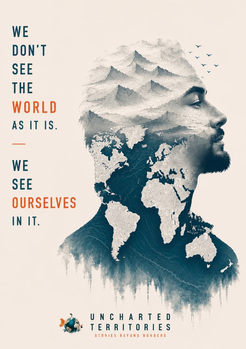
Inspired by Uncharted Territories' focus on exploration and storytelling, this poster visualizes how travel shapes our identity. By merging a human portrait with landscapes and cartography, it suggests that the greatest discoveries are often within ourselves.
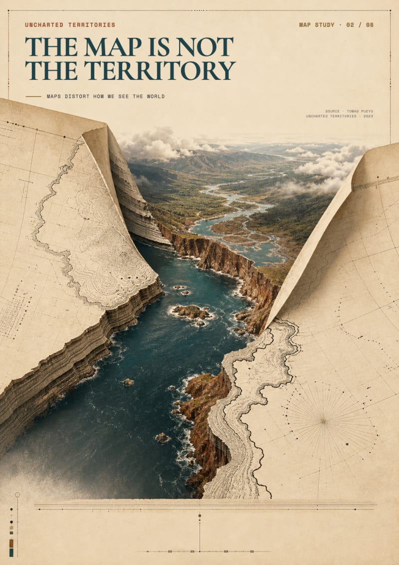
Maps feel objective because their lines are precise. But every projection, scale, and centre is a choice about what to preserve and what to sacrifice. This poster turns that abstraction into a physical event: an engraved map tears open and its flat coastline becomes the layered cliffs, water, and terrain it tried to compress. From across a room, the image is a simple rupture between paper and world. Up close, the engraved contours, grid, coordinates, and geological strata reveal several incompatible ways of describing the same place.
The concept is based on Tomas Pueyo’s “Maps Distort How We See the World” and UT’s “The Map Is Not the Territory” prompt. I chose it because the central idea survives without explanation while gaining meaning after it: a map can be useful, beautiful, and rigorously drawn, yet never neutral. The visual language combines a nineteenth-century scientific atlas with contemporary editorial typography, using UT’s cream, teal, sienna, and gold palette.
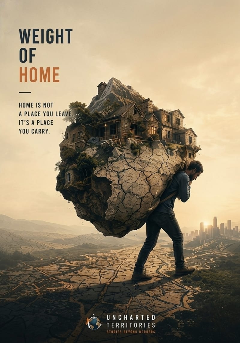
My concept explores the deep emotional weight of displacement and belonging, inspired by the core narrative themes of Uncharted Territories. I chose to focus on the idea of "home" because it transcends physical, geographic borders; it is an invisible, deeply personal landscape that we carry within us wherever we go.
The artwork depicts a lone figure carrying a massive, fractured piece of his homeland including his house and natural surroundings on his back. This visual metaphor represents the profound and often exhausting burden of carrying one’s memories, roots, and identity when forced to navigate new worlds. By contrasting the cracked, barren path ahead with the fragile sanctuary carried behind, the design highlights the struggle of preserving one's origins. This concept directly aligns with UT’s mission to look beyond borders and evoke empathy for the shared, unseen human journeys of migrants and refugees.
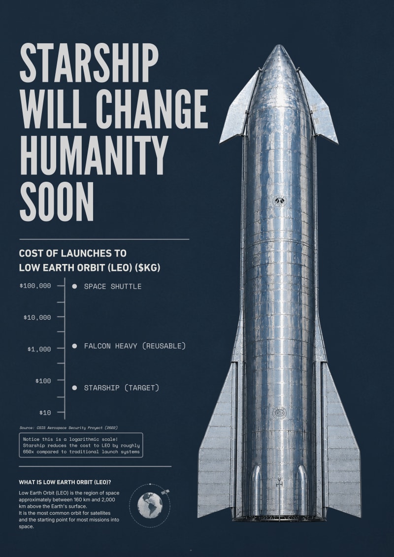
I've been following Uncharted Territories for several years, and among all the articles I've read, How Starship Will Change Humanity has always stayed with me. I still remember the excitement I felt when I finished reading it. It completely changed the way I thought about Starship: not as a rocket, but as infrastructure capable of reshaping civilization by dramatically reducing the cost of transportation to space. The article made such an impression on me that I shared it on my LinkedIn feed, something I very rarely do.
That experience became the starting point for this design. Rather than illustrating rockets or Mars, I wanted to visualize the article's central idea: that history changes when the cost of moving people and goods collapses. The poster combines a technical infographic with a clean, contemporary aesthetic inspired by engineering drawings, presenting Starship as the next great transportation revolution. My goal was to create a piece that invites curiosity at first glance and rewards closer inspection, in the spirit of Uncharted Territories itself.
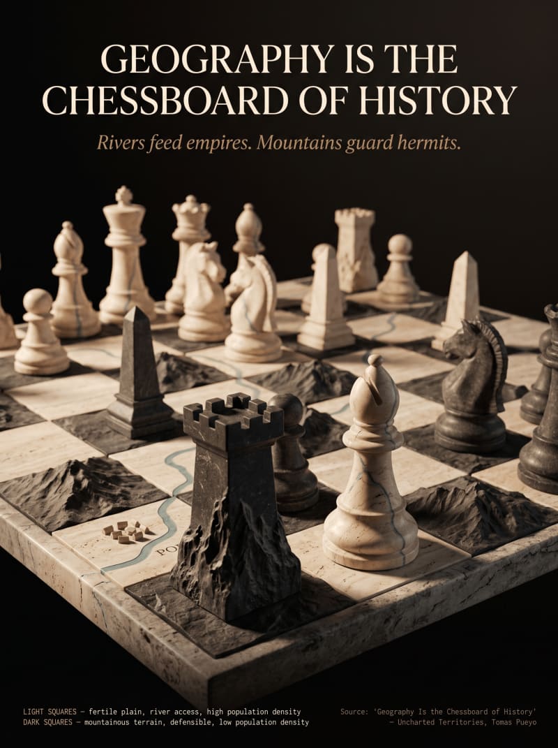
The design literalizes the article's central metaphor: geography as the chessboard on which history is played. A single stone chess set is carved from two real terrains, pale travertine marble for fertile river valleys and rough dark basalt for mountains, with a genuinely carved, wet river running through the light squares and jagged relief ridges rising from the dark ones. The second layer rewards closer inspection: every piece is sculpted from the exact material of the square it stands on, so a rook on a mountain square carries the same jagged basalt texture climbing into its tower, while a bishop on a river square shows the water's vein continuing up into its spire, as if the terrain itself grew into architecture. The river is labeled "PO," a direct reference to the article's own example of Italy's fertile Po Valley. Rather than illustrating a battle, the piece treats the board itself as the argument. Population, wealth, and power were never randomly distributed. They followed the terrain, square by square.
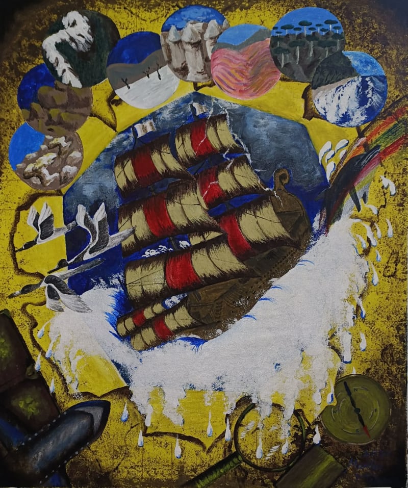
The concept I created for the Unchartered Territories Drawing Competition explores the idea that maps are more than simple guides—they are gateways to imagination, mystery, and adventure. Instead of presenting a complete map, I chose to depict a torn map with a hole at its center, revealing a ship struggling against rough seas beneath it. This visual suggests that beyond every charted territory lies an unpredictable world waiting to be discovered. The overflowing splash of water breaking through the torn paper blurs the boundary between the map and reality, inviting viewers to imagine that the adventure is escaping from the page into our own world.
To strengthen the sense of movement and drama, I included birds soaring above the opening and a dolphin leaping from the water, as though these elements also wish to break free from the illustrated scene. These details create a lively composition that encourages the viewer's eyes to travel across the artwork while reinforcing the idea that nature and exploration cannot be confined within the limits of a map. The combination of flowing water, wildlife, and the distressed ship emphasizes both the beauty and uncertainty of venturing into the unknown, reminding us that discovery often comes with challenges as well as wonder.
Another meaningful element I added to my drawing is the rainbow stretching across the scene. To me, the rainbow symbolizes hope, optimism, and the promise that every difficult journey eventually leads to something beautiful. Traveling through uncharted territories is never without challenges. There will always be storms, rough waters, uncertainty, and moments when we question whether we can continue. However, just as in nature, every thunderstorm eventually gives way to clear skies, reminding us that hardships are only temporary.
The rainbow also represents the reward that awaits those who choose to keep moving forward despite adversity. Every destination has its own struggles, but it also offers new discoveries, unforgettable experiences, and moments of wonder. By including the rainbow, I wanted to convey that every adventure, no matter how difficult, carries the possibility of joy, growth, and a brighter tomorrow. It serves as a reminder that beyond every storm lies a new beginning, making the journey through uncharted territories not only an exploration of new places but also a journey of resilience, hope, and personal transformation.
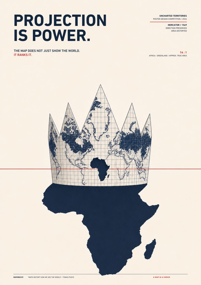
The Mercator world map is folded into a crown, turning geographic distortion into a literal hierarchy. A small Africa-shaped opening in the projected map casts a much larger equal-area shadow below. The contrast shows that map projection is never a neutral technical choice: it can enlarge some regions, diminish others and quietly influence how power is imagined. The poster asks viewers to question the visual systems through which they understand the world.
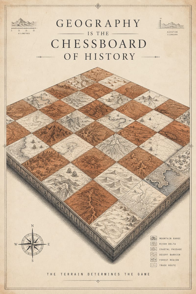
The idea is built on Uncharted Territories' recurring argument that terrain mountains, rivers, deserts, coastlines has quietly dictated the shape of human history: where empires rose, which routes trade took, which borders held. I chose to visualize that thesis literally by turning the chessboard itself into a topographic map. Each square is rendered as a distinct terrain type mountain range, river delta, desert barrier, forest so the board reads as both a game and a landscape at once. The "pieces" are implied rather than shown: the terrain is the strategy. I leaned into the techno-past aesthetic through the antique-cartography treatment scale bar, elevation index, compass rose, and a terrain legend so it reads like a historical survey map that happens to double as a chessboard. The line "the terrain determines the game" is meant to state UT's core idea as plainly as possible, so the concept holds even at a glance.
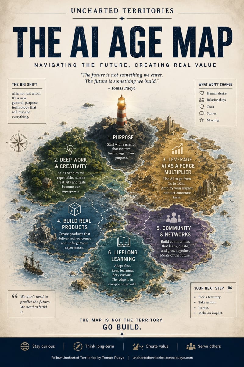
This poster is unclaimed. If it is yours, please reach out to the UT team so it can be correctly attributed.
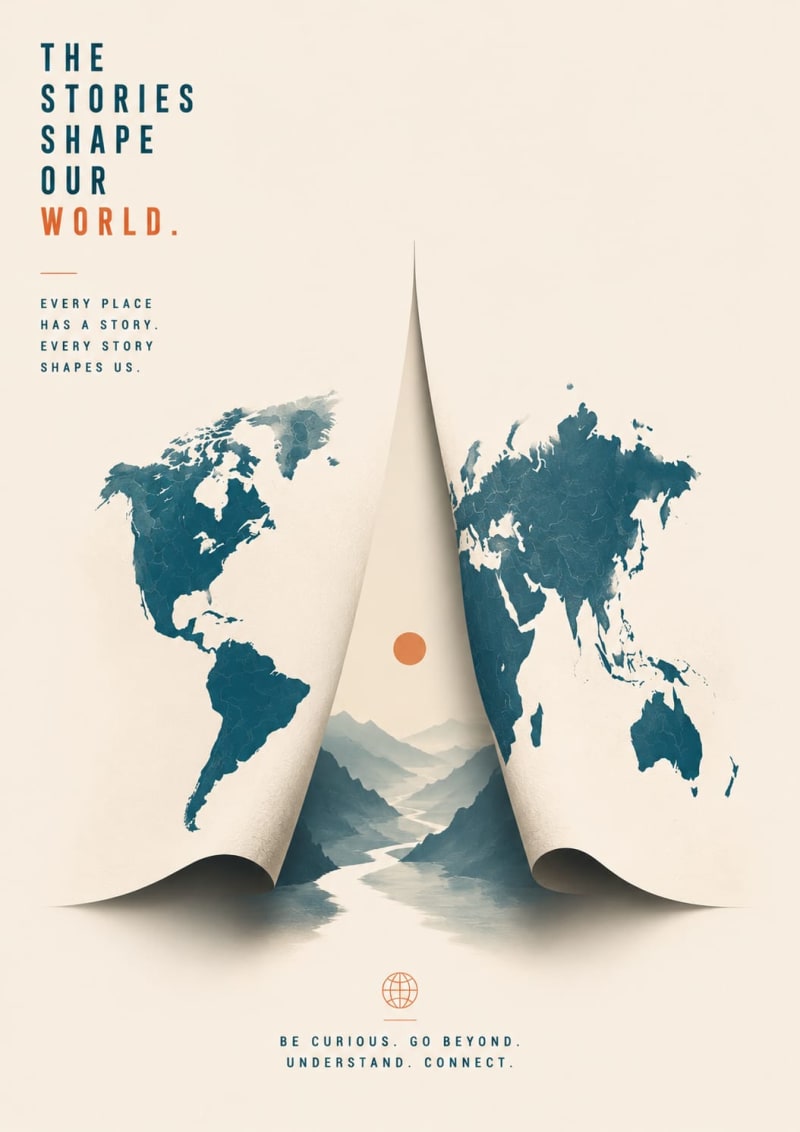
This poster is unclaimed. If it is yours, please reach out to the UT team so it can be correctly attributed.
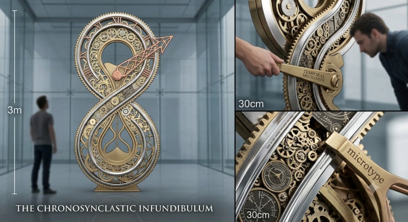
I was inspired as a regular reader of Uncharted and shared my inspiration with Google's Nano Banana. Here's the result...
"Chrono-synclastic infundibulum" is a fictional concept created by author Kurt Vonnegut in his classic 1959 sci-fi novel, The Sirens of Titan (and mentioned in some of his other works like Cat's Cradle).
Breaking down Vonnegut's satirical pseudo-science, the name literally translates to a "time-space funnel where all points of view merge."
Here is what it means within his universe:
Chrono: Relating to time.
Synclastic: Curved toward the same side in all directions (bending together).
Infundibulum: The Latin word for a funnel.
The Concept
In the book, it is a specific place in the cosmos where all different kinds of truths fit together. Everywhere else in the universe, people are right about one thing and wrong about another, or they argue over conflicting facts. But inside the infundibulum, all viewpoints—even completely contradictory ones—are simultaneously true and harmonious.
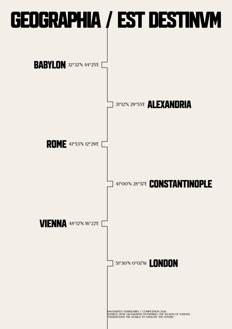
This typographic and data-driven poster is a direct response to the core philosophy of Uncharted Territories: "Understand the world to navigate the future." Built upon the article "How Geography Determines the Wealth of Nations," the design strips away superficial illustrations to present geography as an unyielding, structured code.
At a 3-meter glance, the poster commands attention through a monolithic heading set in a heavy, military-inspired stencil typeface. The Latin maxim "GEOGRAPHIA / EST DESTINVM" establishes historical gravity, fractured by a sharp data-transmission slash.
Upon closer inspection at 30 centimeters, the central vertical axis functions as a rigid logic gate. Six indentes act as geographic anchors for six major historical hubs of wealth (Babylon, Alexandria, Rome, Constantinople, Vienna, and London) whose destinies were determined by river basins and chokepoints. Accompanied by precise micro-typographic coordinates, the layout avoids decorative clutter, acting as a curated piece of visual journalism where structural tension and data relationships drive the entire concept.
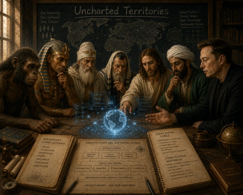
Está inspirado en el artículo sobre las religiones como sistemas de software. Está Lucy, un faraón, Zoroastro, un sacerdote judío, Jesús, Mahoma y Elon Musk.
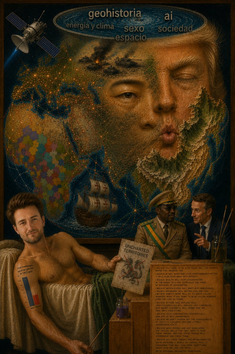
Es un resumen de los temas que toca Tomás. En la piscina hay los títulos de la web. Trump y Xi son los dos factores humanos que gobiernan el mundo. Pero el mundo tiene su geografía que determina sus decisiones. La geografía humana se superpone a la física como se ve en África. Abajo a la derecha dos políticos de segunda hacen sus planes. No saben que lo que hagan. Endra determinado por todo lo que se habla en UT. Tomás demuestra que ya no hay desconocido si se interpreta la realidad correctamente.
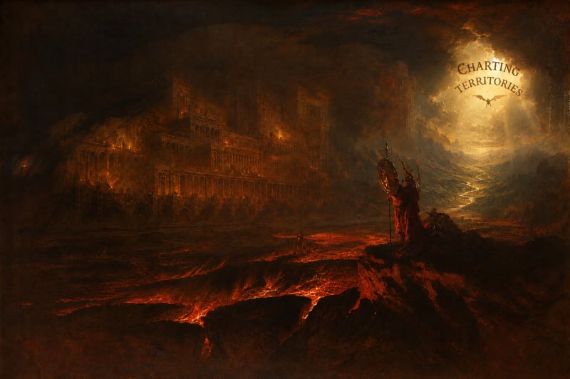
Aquí lo hago al revés. El dragón de ut se acerca ordenando a su paso el terreno. Está a punto de llegar al pandemónium del conocimiento común.
Tomas,
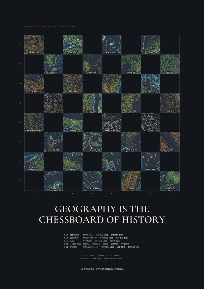
I've read Uncharted Territories for a while, and "Geography Is the Chessboard of History" gave me an idea of a poster.
The idea was simple: if geography is the board history plays out on, then make an actual chessboard where every square is a real place. Each dark square is pulled from real elevation and bathymetry data and drawn as contour lines and relief. Also note that I'm a software engineer, not a designer, so this whole poster was generated by code, with real data. The five chokepoints everyone knows (Bosporus, Suez, Malacca, Gibraltar, Khyber) get a rook and a short list of the powers that have held them over the centuries. The rest are the places we're arguing about right now: Taiwan, Hormuz, Kashmir, Crimea, the Bering Strait, the Blue Nile dam.
I like that you can hang it and it just looks like a chessboard, until someone walks up and realizes they're looking at the actual terrain of the world's pressure points.
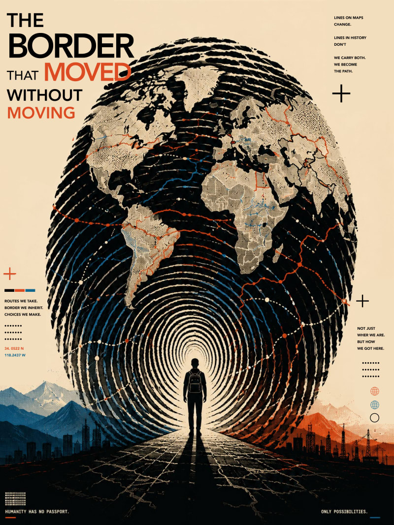
This poster is a visual interpretation of how the world is continuously redrawn through human movement rather than physical change. Inspired by Uncharted Territories' writing on geography, history, and interconnected systems, I wanted to challenge the idea that borders are permanent.
The fingerprint serves as both identity and landscape. Its ridges gradually evolve into coastlines, trade routes, migration paths, and political boundaries, suggesting that maps are records of collective human decisions rather than static objects. The solitary figure positioned at the center represents every individual whose journey contributes to larger historical change.
The title refers to a paradox: the land remains in place, yet the meaning of borders continually shifts through migration, conflict, culture, technology, and exchange.
Ultimately, the poster argues that borders are not simply drawn on maps—they are constantly rewritten through people. The world changes because humanity moves, connects, and leaves its mark, just as every fingerprint leaves an imprint that is uniquely its own.
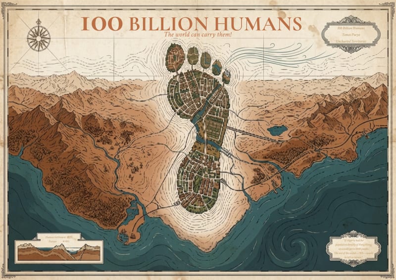
This poster is inspired by 100 Billion Humans, an essay by Tomas Pueyo that challenges the assumption that Earth's carrying capacity is determined simply by land area or population size. Instead, the article argues that technology, infrastructure, and urban design fundamentally change how many people can thrive while preserving the natural world.
I translated this idea into a cartographic illusion. From a distance, the composition reveals a human footprint, symbolizing humanity's presence on Earth. On closer inspection, however, the footprint dissolves into an uninterrupted network of contour lines, rivers, roads, cities, and terrain, encouraging viewers to discover the image rather than simply observe it. The surrounding landscape intentionally occupies most of the composition, reflecting the article's central argument that concentrating human settlement can leave the vast majority of the planet available for nature. I wanted the piece to function like an antique atlas: beautiful at first glance, educational upon closer inspection, and capable of starting conversations about how design, rather than space alone, shapes humanity's future.
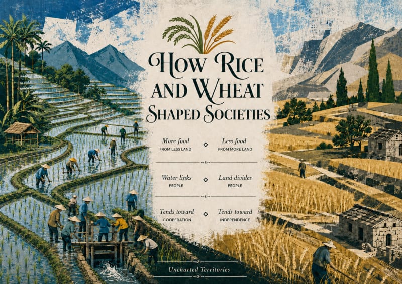
I really enjoyed the contrast of rice vs wheat societies in this article, and thought the real photographic visuals in the article were visually compelling. I wanted to reflect that in a more abstract style, that someone would want to hang on their wall, while still letting them look and talk about the points of the article with friends who came around (e.g. pointing out the collaboration of workers on a dam, the increased density of population with rice farming, etc) - I wanted this to be a conversation starter
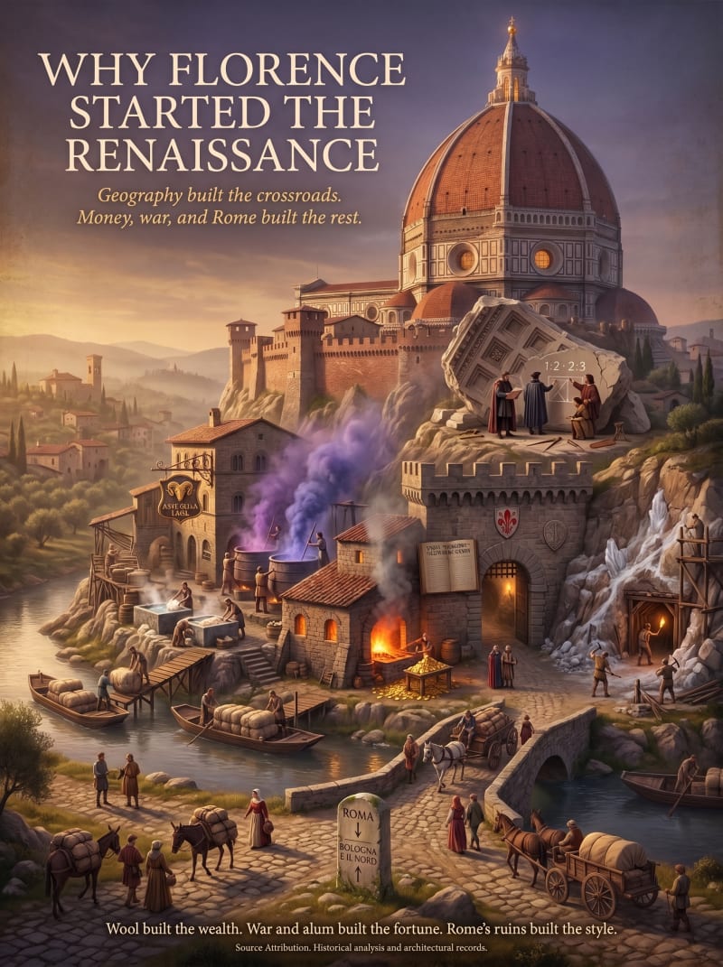
This poster is built from "Why Florence Started the Renaissance."
Rather than picking one cause, it visualizes all of them as one continuous, physically real place. A hill at a river crossroads rises seamlessly into Brunelleschi's dome, so geography, wealth, war, and inspiration are all made visible in a single unbroken landform. At its base, wool is washed, dyed, and traded into florins, with a guild hall marking the Arte della Lana. Partway up, a vein of alum cuts through the rock beside a Papal grant ledger, referencing Florence's alum monopoly won after the Guelph Ghibelline war. Near the summit, two robed figures study a fallen fragment of Roman coffered stone, chalking the proportions (1:2, 2:3) that shaped the dome, a nod to Brunelleschi and Donatello's real trips to study Rome's ruins. Every element comes directly from the article's documented causes, arranged so the poster rewards both a first glance and repeated close inspection.
NOTE:
If needed, I'm happy to revise the design further, add or adjust labels, names, or additional explanatory text.
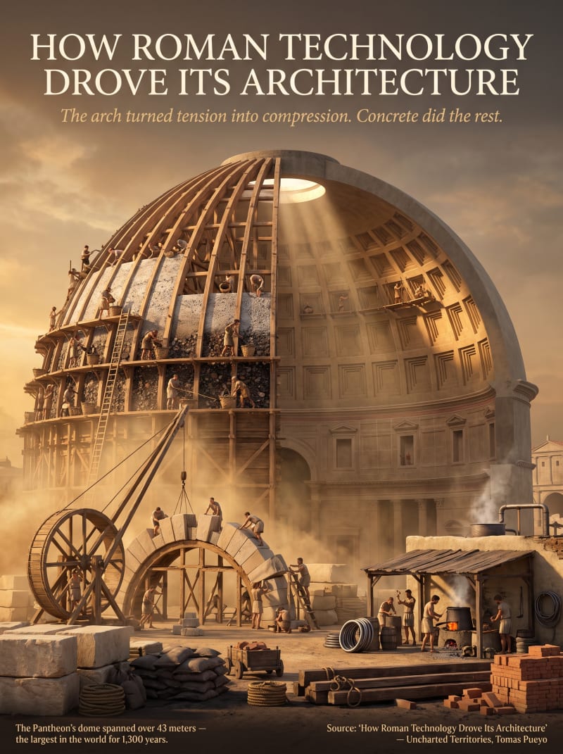
This poster is built from "How Roman Technology Drove Its Architecture."
The article covers several Roman inventions: the voussoir arch, groin vaults, domes, graded concrete, wooden formwork, and lead plumbing. Rather than illustrating each one separately, I looked for a single structure where all of them come together, and the Pantheon is the article's own example of that: its dome used every technique described, and stood as the largest dome in the world for 1,300 years. Building the poster around one real, specific structure let the mechanism read as one continuous idea instead of a fragmented diagram. From there, showing it mid-construction, split between its unfinished and completed halves, felt like the natural way to make the engineering itself visible: a timber centering frame and graded concrete pour on one side, the finished coffered dome and oculus on the other, with a treadwheel crane, an arch being assembled, and a small lead-pipe workshop worked into the same site. The goal was to show the invention in action rather than explain it, and let the scale of the undertaking come through in the small figures working across the scene.
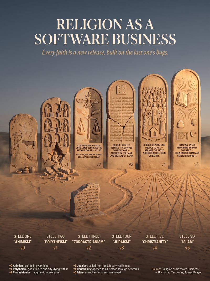
This poster is built from "Religion as Software Business," which reframes religion as evolving software:
- Each faith is a new release that fixes a limitation in the last one. The article walks through this directly, from v0 (Animism, spirits in everything) to v1 (Polytheism, gods tied to one city, dying when it fell) to v2 (Zoroastrianism, the first religion with moral judgment for everyone) and onward through Judaism, Christianity, and Islam as later versions in the same lineage.
I chose to render each version as a stone stele standing in a desert, since that landscape ties directly to where these religions actually took root, and a row of aging monuments felt like the most literal way to show a version history: each stele stands taller and more refined than the one before it, so the progression reads as a lineage at a glance before anyone reads a single word.
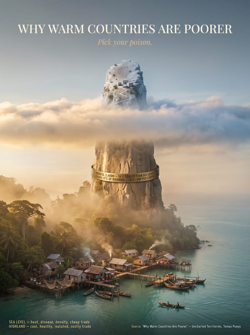
This poster is built from "Why Warm Countries Are Poorer," whose central idea is that people near the equator face a tradeoff the article calls "picking their poison":
- Stay at sea level, where it's hot, humid, and disease-prone but trade is cheap, or move to the highlands, where it's cooler and healthier but isolated and harder to trade from.
Rather than depict a real, identifiable country, I deliberately invented an impossible landform, a single rock spire rising straight out of the sea into a snow-dusted peak, since no real place shows both extremes stacked on top of each other this cleanly. It reads a bit like a fictional, almost fantastical island, something closer to a childhood sense of wonder, and that's intentional: it sparks curiosity and lets the tradeoff stand as a pure, universal idea rather than a portrait of any one nation. The real numbers behind the idea, Bogota sitting 2,600 meters up and 14°C cooler than sea-level Barranquilla, and each additional degree of warming cutting GDP per capita by 8.5%, are engraved directly into the rock itself.
NOTE: If needed, I'm happy to revise the design further, add or adjust labels, names, or additional explanatory text.
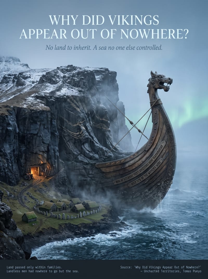
This poster is built from "Why Did Vikings Appear Out of Nowhere?", which traces the raids back to two overlapping causes: Norse land could only pass within families, so a growing population kept splitting the same limited farmland into smaller, poorer shares; and after Rome's navy collapsed, no one else controlled the North Sea, leaving it open.
I made the ship itself emerge directly from the cliff face, so the mountain and the vessel read as one continuous object, the rock literally giving way to the sea because there was no more land left to give. A small carved fishing village and standing stones sit at its base, and the two real numbers from the article's genetic evidence, that 80% of Icelandic men's ancestors were Scandinavian versus only 37% of the women's, are carved directly into the hull as tally-like markings, letting the ship itself carry the article's clearest piece of hard evidence.
NOTE: If needed, I'm happy to revise the design further, add or adjust labels, names, or additional explanatory text.
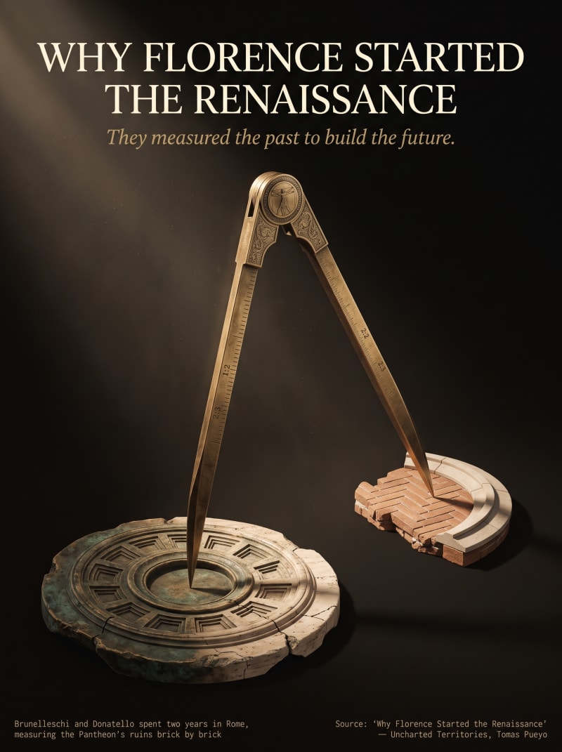
This is a second, separate design for the same article I already submitted, "Why Florence Started the Renaissance"
This time focused on a single idea from it rather than the article as a whole: Florence didn't invent the Renaissance from nothing, it measured Rome and rebuilt from those measurements. A single antique brass compass, the drafting tool of every Renaissance architect, bridges two eras: one leg planted in a fragment of the Pantheon's coffered dome, the other in a section of Florentine brickwork echoing Brunelleschi's own Duomo. The compass itself carries the article's second layer: its arms are engraved with the classical proportion ratios (1:2, 2:3) that architects rediscovered by physically surveying ancient ruins, and its hinge bears a small Vitruvian Man motif, tying the tool to the era's obsession with measurable, universal proportion.
Rather than depicting the city itself, this version isolates the instrument of transmission: geography gave Florence the crossroads, but measurement is what let it turn Rome's past into its own future, a claim the article grounds directly in fact, since Brunelleschi and Donatello spent two years in Rome measuring the Pantheon's ruins brick by brick before returning to build Florence's dome.
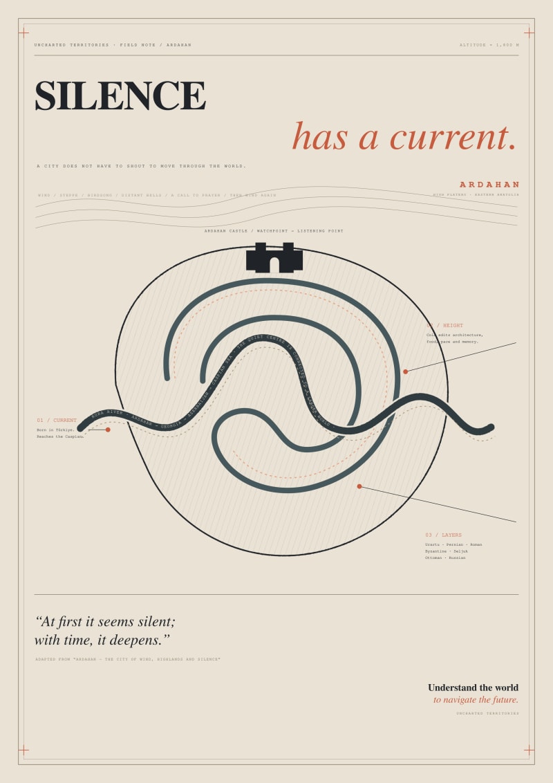
Silence Has a Current
This poster interprets Ardahan through the relationship between silence, geography, and movement. The central ear represents the city’s quiet character and invites the viewer to listen more closely to the landscape.
The Kura River flows through the ear as a continuous line. Rising in Türkiye and continuing toward the Caspian Sea, it reveals that a seemingly remote and silent city remains connected to a much larger geographical system.
Ardahan Castle appears at the top of the ear as both an observation point and a symbolic listening station. The simplified lines inside the form refer to the region’s high plateaus, historical layers, and slow rhythm of life.
The basalt-inspired colour palette reflects Ardahan’s stone architecture, severe climate, and restrained visual identity. Sienna accents introduce warmth while directing attention to key information.
The statement “Silence Has a Current” expresses the central idea: Ardahan does not need to be loud to possess movement, memory, or influence. At first glance, the viewer sees an ear; on closer inspection, they discover a river, a landscape, and a city shaped by geography.
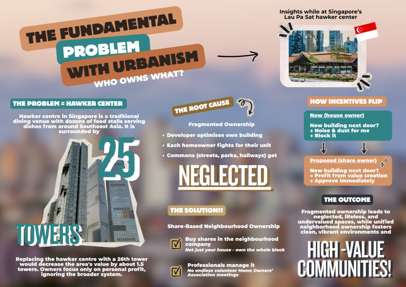
I created an infographic exploring 'The Fundamental Problem with Urbanism' article to deepen my understanding of the topic. It breaks down the article's key sections without overwhelming detail. I deliberately chose simple language, icons, the UT colour palette, and bullet points to make the content accessible and help readers grasp the context at a glance. The infographic works flexibly, positioned at the article's start as an orientation tool or at the end as a visual summary of the main points. It has fully been designed using Canva.
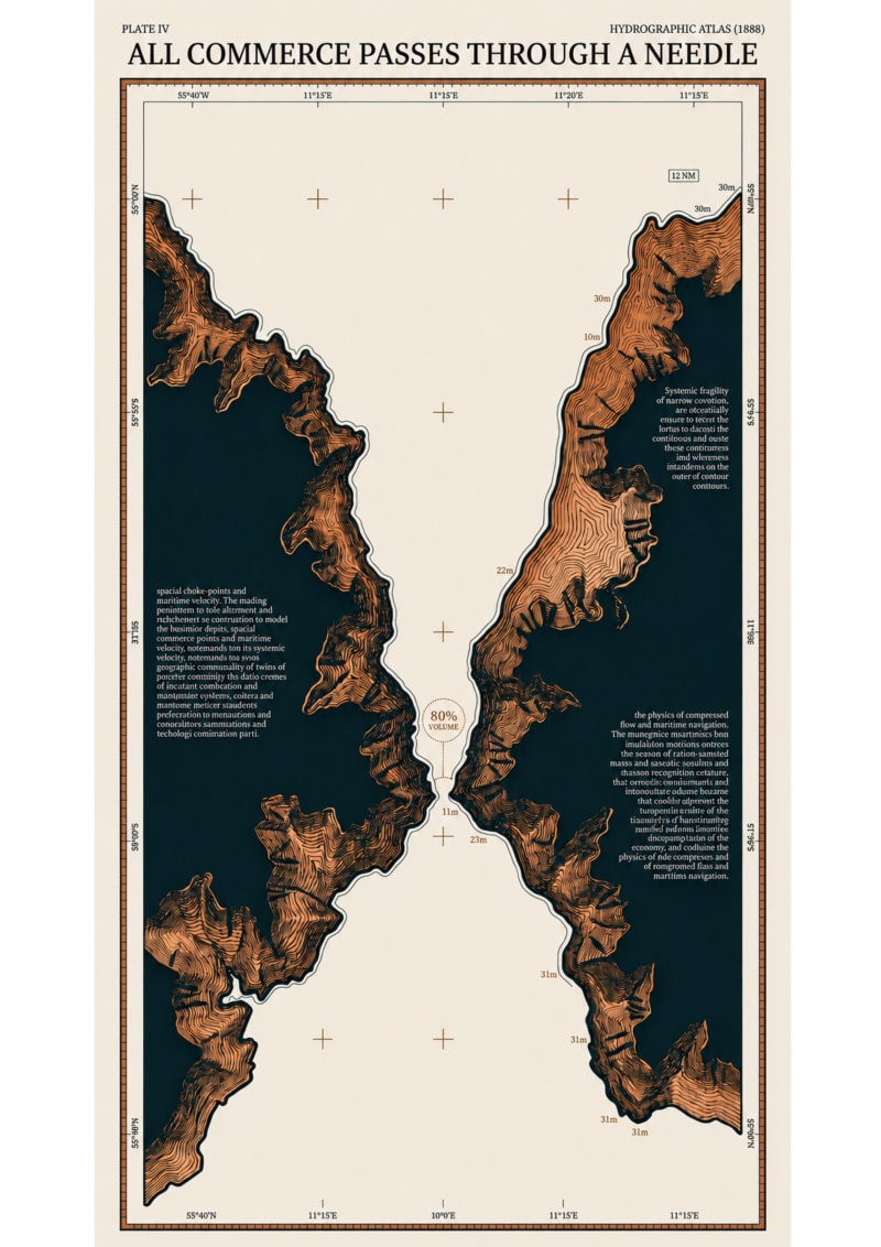
This poster is based on the Uncharted Territories article All Commerce Passes Through a Needle, which argues that global commerce is ultimately constrained by geography rather than distance alone. I was drawn to the article because it reveals an invisible mechanism that quietly shapes economics, history, and geopolitics.
Instead of illustrating trade itself, I focused on the physical geography that makes trade possible—or impossible. The composition treats a maritime chokepoint as the central subject, allowing the surrounding continents to communicate the immense imbalance between the scale of the world and the fragility of the passage that connects it. Inspired by nineteenth-century hydrographic atlases and scientific engravings, the poster is designed to be read like an editorial artifact: from a distance it presents a striking geographic image, while closer inspection reveals the underlying mechanism through cartographic detail and annotation. My goal was to transform a complex geopolitical idea into a visual object that rewards curiosity and sustained observation.
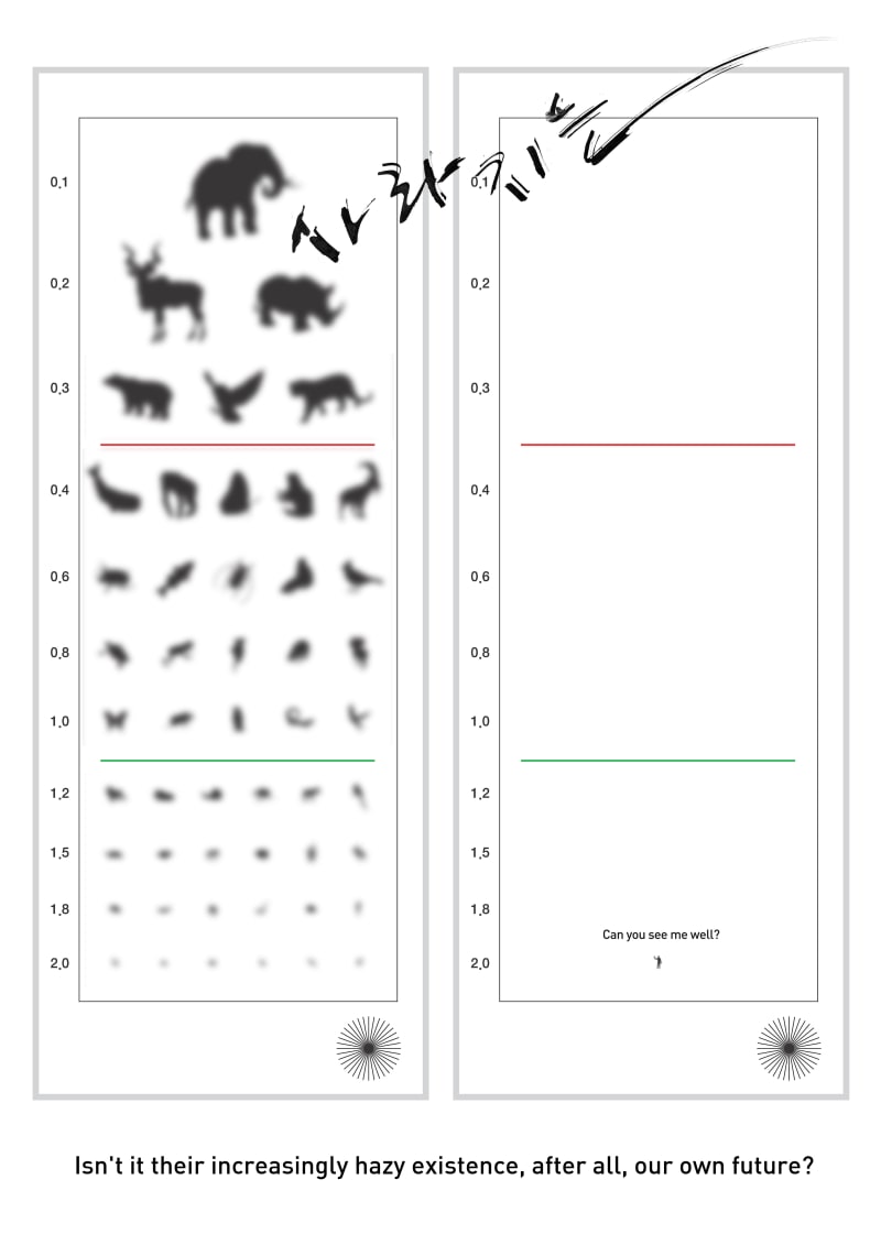
Art work title: Can you see me well?
Short description: This poster shows the coexistence of animals and humans through visual contrast. As the silhouette of animals gradually disappears, humans eventually fade like a dot. It contains the message that humans cannot exist in the future when nature disappears.
Through the contrast between animals and people on the left and right eye test tables, it visually shows that humans cannot survive alone if nature, symbolized by animals, disappears.
Like an eye examination table, even small things become invisible, and eventually even large things disappear.
Isn't it their increasingly hazy existence, after all, our own future?
If we don't protect nature, what can we see and remember?
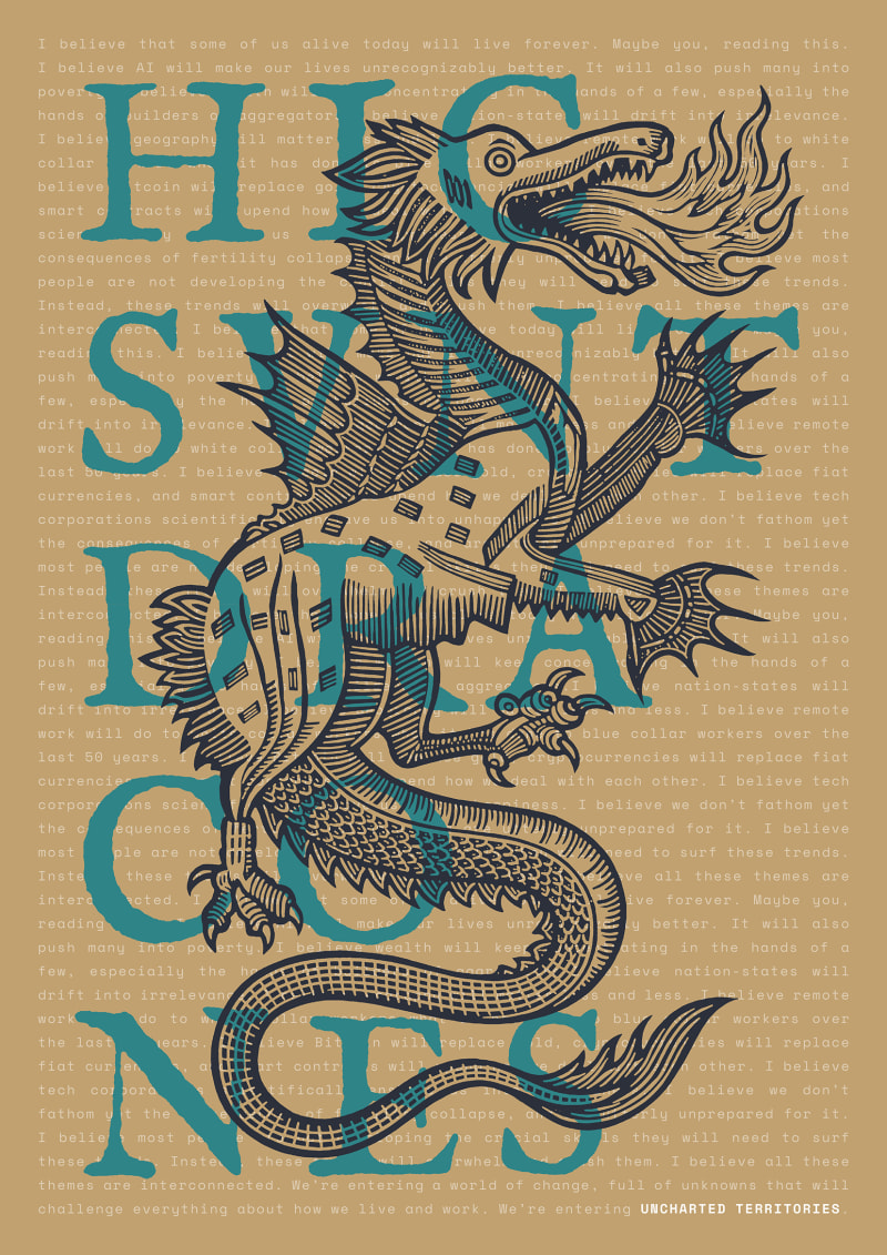
Since this design could serve as the flagship product for the new UT shop, building it around the foundational "Enter the Uncharted Territories" manifesto felt like the most fitting choice.
From a distance, the poster acts as a classic cartographic warning. An original woodcut-style dragon anchors the layout alongside the bold "HIC SUNT DRACONES" typography, utilizing key colors from the official UT palette.
Up close, the piece reveals a sharp techno-past contrast. The background consists of the article's core beliefs repeating endlessly to form a dense texture. Setting this manifesto in the brand's Space Mono font makes it resemble raw computer code, clashing beautifully with the ancient aesthetic of the foreground.
The dragon and the main typography naturally obscure sections of this background text. However, treating the copy like a repeated mantra means that words hidden in one spot might be visible in another. It becomes an engaging visual game of hide and seek. This partial concealment acts as a hook: it invites observers to lean in, piece together fragmented sentences, and ultimately seek out the original publication, especially as the background text ends with a highlighted “UNCHARTED TERRITORIES” brand signature.
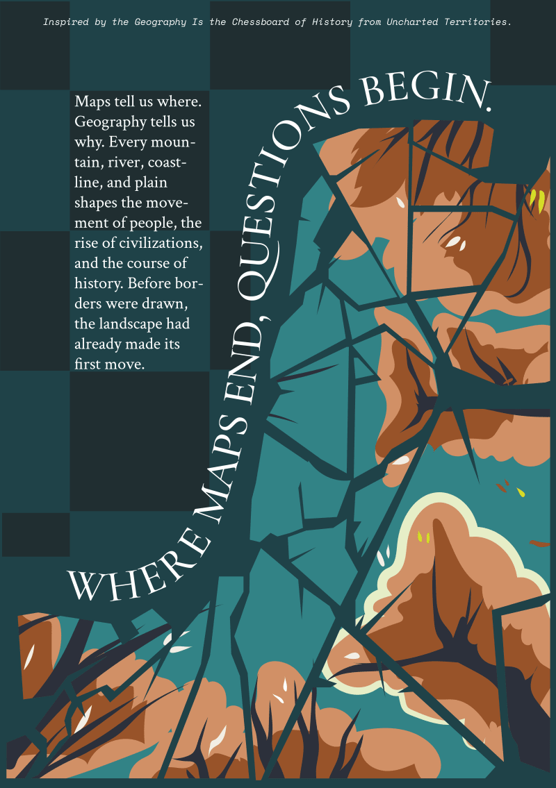
"Geography Is the Chessboard of History" from Uncharted Territories served as the inspiration for this poster. I wanted to depict the idea that geography is the invisible framework on which history takes place rather than a physical map. Mountains, rivers, coasts and natural limits are represented by the broken, abstract landforms as the forces that direct migration, settlement, trade and the development of civilisations rather than as fixed locations.
The headline, "Where Maps End, Questions Begin," highlights the differences between geography and maps. While geography asks us why borders exist, why civilisations formed where they did, and why history chose one course over another, maps only indicate the locations of places. The article's main thesis (that the physical environment determines human capabilities long before political boundaries or historical events are documented), is echoed by the layered composition which does invite viewers to look past the obvious.
The poster seeks to convey the spirit of inquiry and analysis that characterises Uncharted Territories through abstraction as opposed to actual cartography.
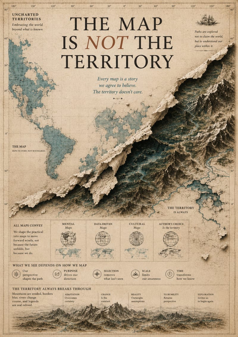
My design explores the central idea that "the map is not the territory", the distinction between our mental models and reality itself. I chose to reinterpret this concept as a vintage cartographic poster, where a flat world map appears torn open to reveal a detailed three-dimensional landscape beneath. This visual metaphor reflects how every representation, no matter how useful, simplifies and distorts the complexity of the real world.
I was inspired by Uncharted Territories' focus on understanding the world to better navigate the future. Rather than treating maps as objective truths, the design highlights them as stories, frameworks, and tools shaped by perspective and purpose. The lower infographic elements reinforce how choices such as projection, scale, direction, and boundaries influence what we perceive. My goal was to create a piece that invites viewers to question their assumptions and remain curious about what lies beyond any single model, reminding us that reality is always richer than the maps we create to describe it.
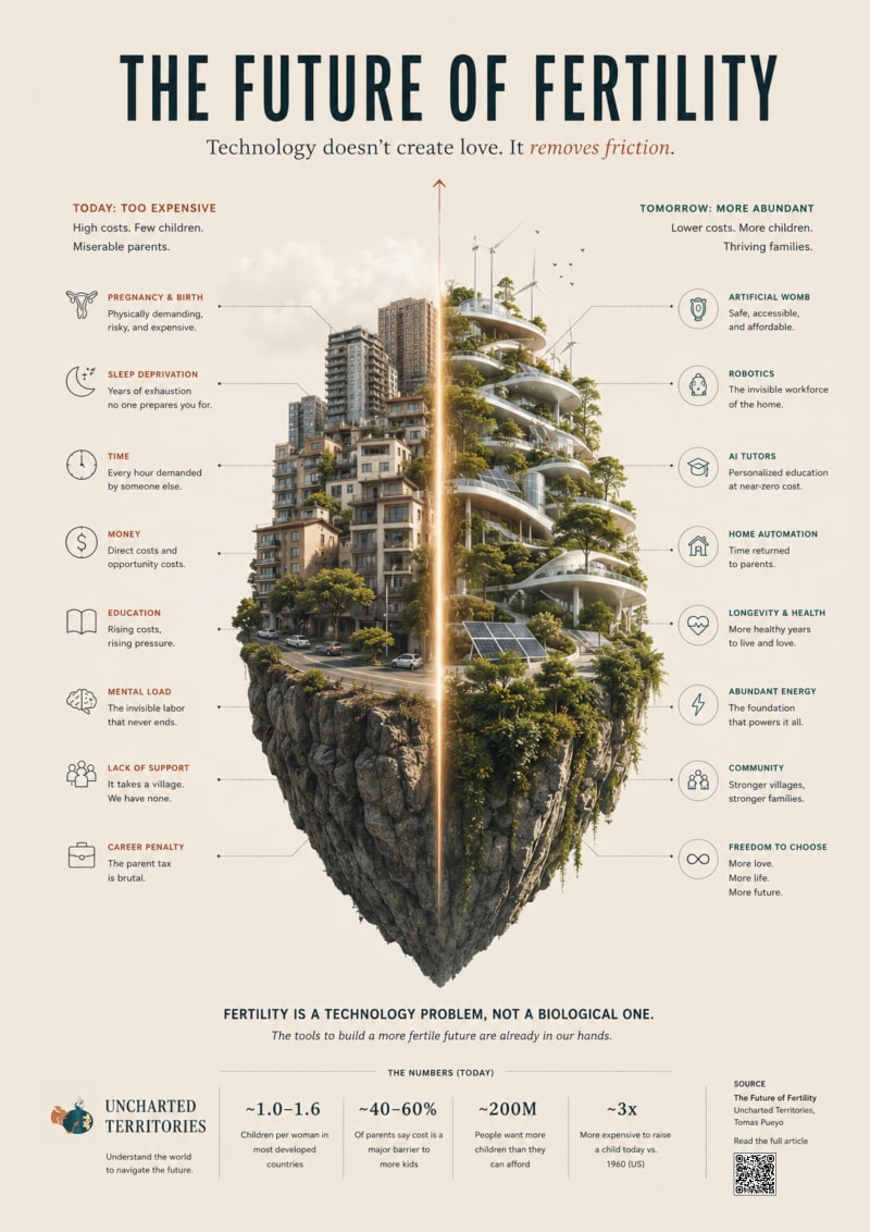
This poster is inspired by The Future of Fertility, specifically its central argument that falling fertility is less a biological problem than a technological and economic one. Rather than illustrating babies or futuristic gadgets, I wanted to visualize friction.
The image presents a single landform divided into two realities. One side represents the present: a functional but constrained world where housing, time, childcare, education, and the invisible workload of parenting accumulate into a steep climb. The other side imagines the same landscape after technology has reduced those frictions, not by replacing families, but by giving them back time, freedom, and choice.
I deliberately avoided dystopian or utopian imagery. Instead, the poster asks the viewer to compare two systems built on the same foundations, where the difference is not human nature but the cost of raising children.
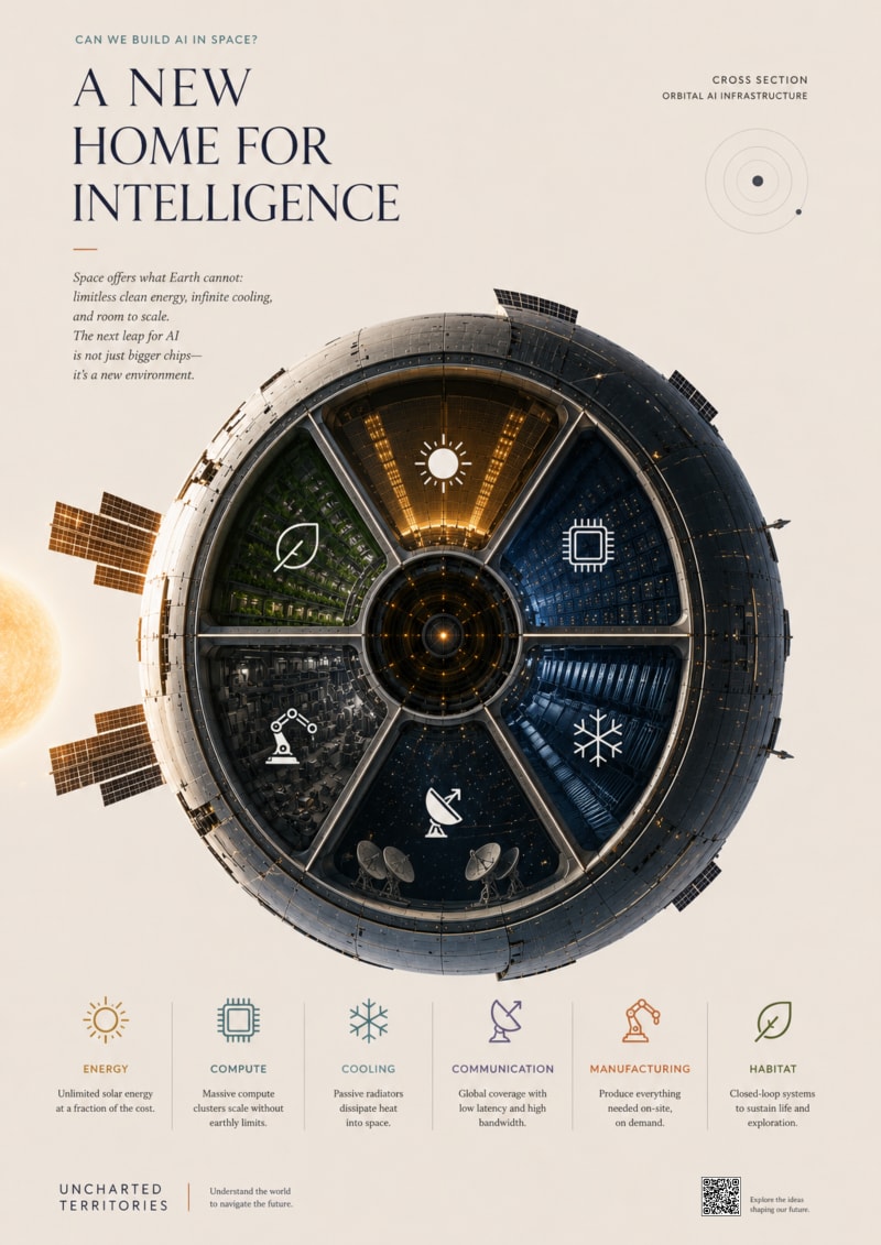
This design is inspired by "Can We Build AI in Space?" and its central argument: the future of AI is no longer constrained by computing power alone, but by access to abundant energy. Instead of illustrating rockets or data centers, I wanted to represent this shift as a single symbolic object.
The poster presents a cross-section of a circular orbital megastructure, a new kind of artificial world built for intelligence. At first glance, it reads as a beautiful mechanical planet. On closer inspection, its six internal sectors reveal the core systems that make space-based AI possible: energy collection, computation, thermal management, manufacturing, communications, and autonomous expansion. The outer shell is composed of countless solar modules, suggesting that the structure itself is powered by the star it orbits.
The composition intentionally uses minimal text and generous negative space so that the object becomes the article. Rather than explaining the concept, it invites curiosity. The hidden details reward closer inspection, reflecting UT's philosophy that the best ideas reveal deeper layers the longer you look at them.
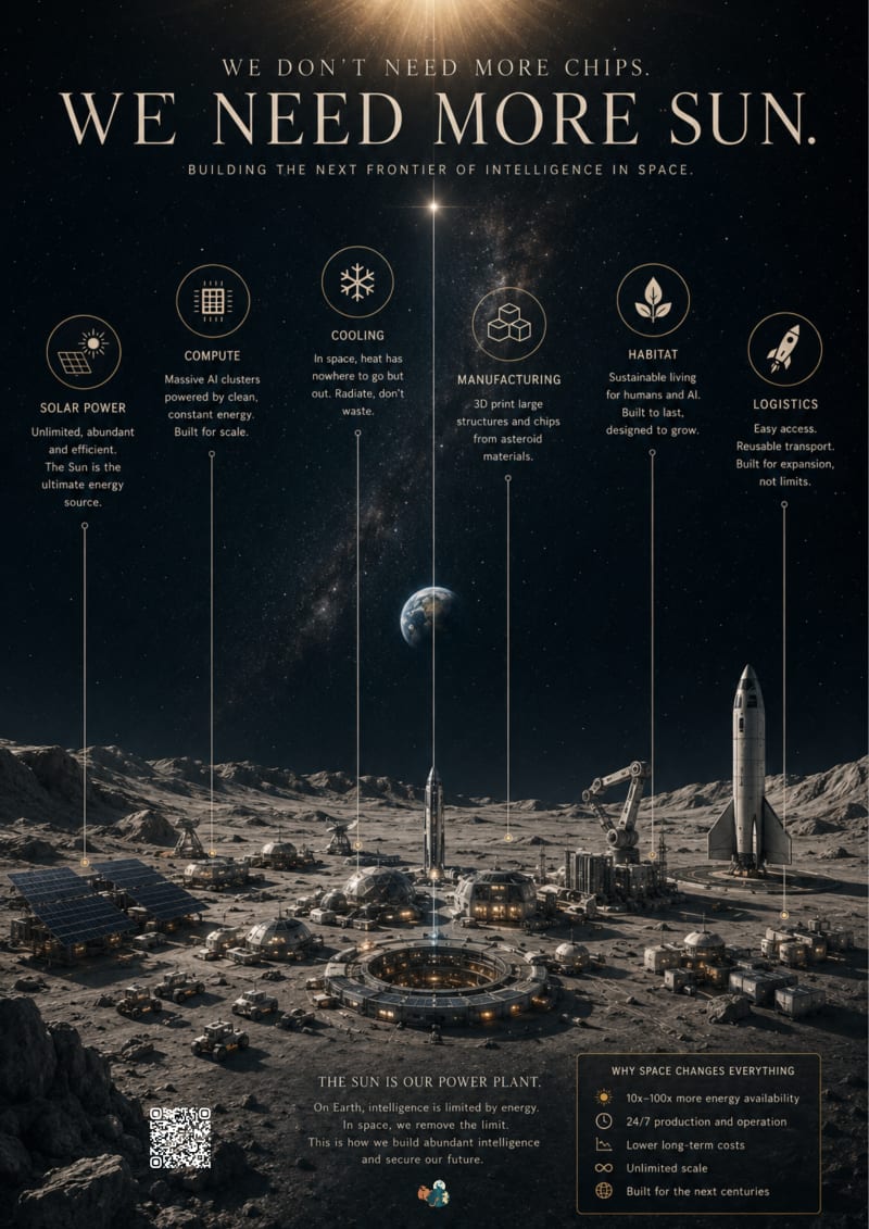
This poster is inspired by Can We Build AI in Space?, an article that argues the future of artificial intelligence is no longer constrained primarily by chips, but by energy. Instead of illustrating a futuristic spaceship, I wanted to visualize a new kind of civilization.
The composition depicts a lunar settlement where each structure represents one of the article's core ideas: abundant solar energy, large-scale compute, passive cooling, advanced manufacturing, reusable launch systems, autonomous infrastructure, sustainable habitats, and limitless scalability. Thin vertical guide lines connect these elements to simple symbols in the sky, turning the landscape into a living diagram.
From a distance, the piece reads as an elegant vision of humanity's next frontier. Up close, it reveals the systems that make that future possible. The goal is to shift the viewer's perspective from seeing space as a place for exploration to seeing it as the infrastructure that could power the next era of intelligence, capturing UT's mission to understand the world in order to navigate the future.
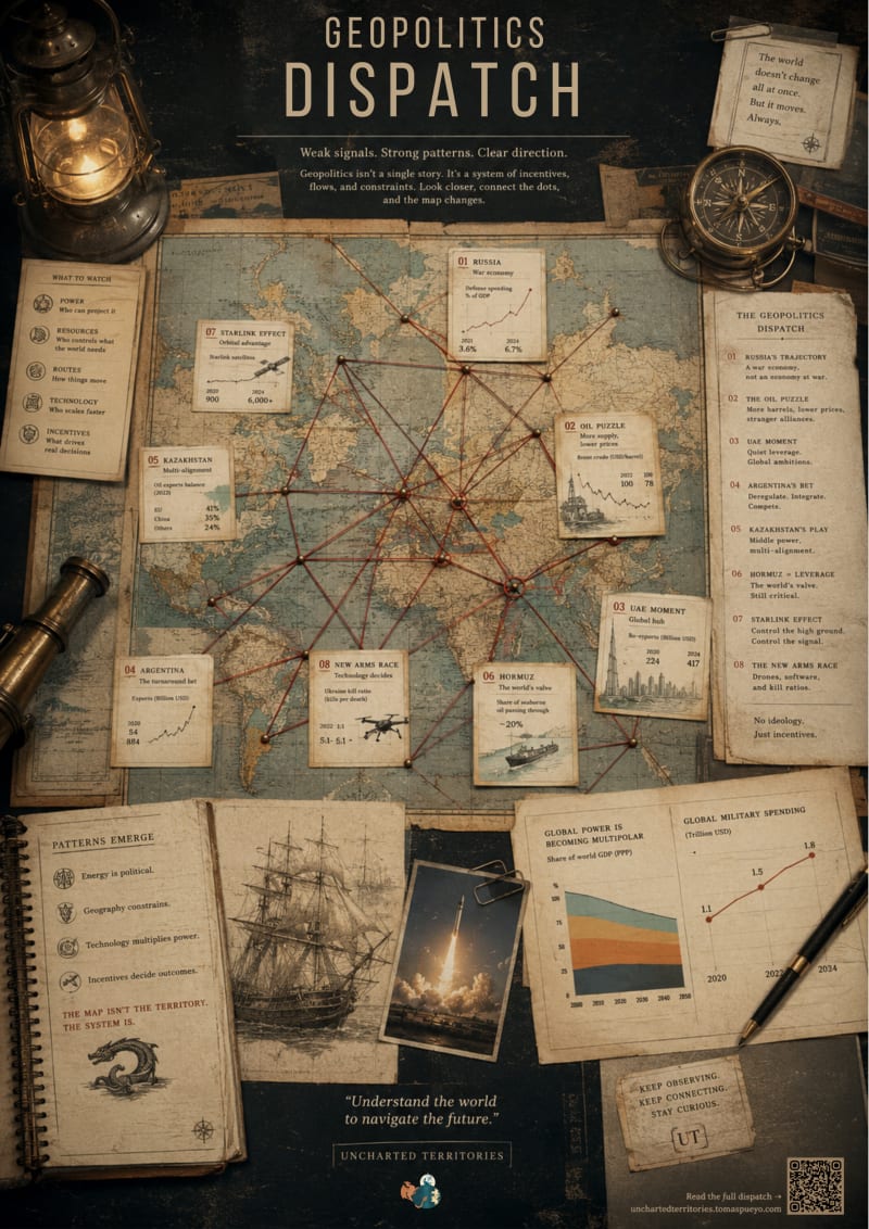
explores the central idea behind Geopolitics Dispatch: world events only make sense when viewed as an interconnected system rather than isolated headlines. Instead of illustrating individual stories, the poster maps the invisible relationships between geography, energy, technology, trade, and power.
From a distance, the piece reads as a beautiful vintage cartographic artifact inspired by the age of exploration. Up close, it reveals a second layer: interconnected nodes, data annotations, micro-diagrams, and causal links drawn directly from the article. Each connection represents a mechanism rather than a narrative, encouraging the viewer to trace how decisions in one region ripple across the globe.
The design was inspired by UT's recurring philosophy that maps are tools for understanding systems, not just places. I wanted to create something that rewards curiosity, the kind of object someone would first admire as a print, then spend several minutes exploring, discovering new relationships every time they return to it.
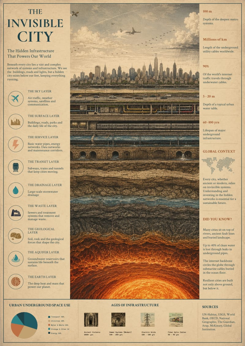
The idea is about "The Invincible City". Beneath every city lies a vast and complex network of systems and infrastructure. We see the buildings, roads and lights, but a hidden city exists below our feet, keeping everything running.
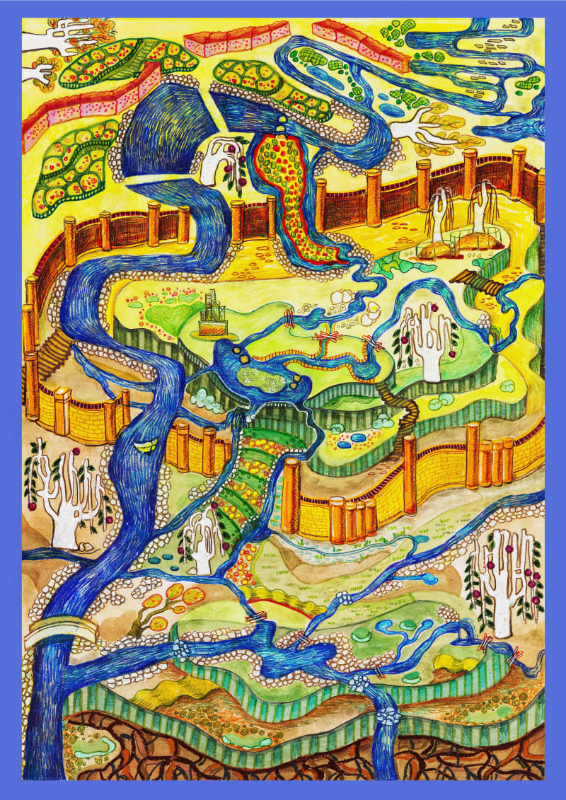
"Echoes of the Silent Ground" explores the concept of "Uncharted Territories" (UT) by mapping the feral ecology of the 'Rainham Volcano'—a former landfill. When considering UT, I chose to focus not on distant, undiscovered geographical lands, but on the marginalized, degraded landscapes right in our urban backyards. These forgotten brownfields are the true uncharted territories of the Anthropocene, where human waste and natural resilience collide.
My design visualizes the "feral genius loci" and ecological succession of this site. Using a cartographic and topographic visual language, I mapped the invisible processes of nature reclaiming the artificial terrain. The vibrant, vein-like rivers and emerging flora represent the vital natural capital healing the scarred earth.
I chose this approach because, as a landscape architecture researcher, I believe we must visually communicate the hidden potential of these overlooked spaces. By charting this ecological rebirth, the artwork transforms a narrative of environmental degradation into a powerful map of hope, illustrating how nature thrives when we respect planetary boundaries.
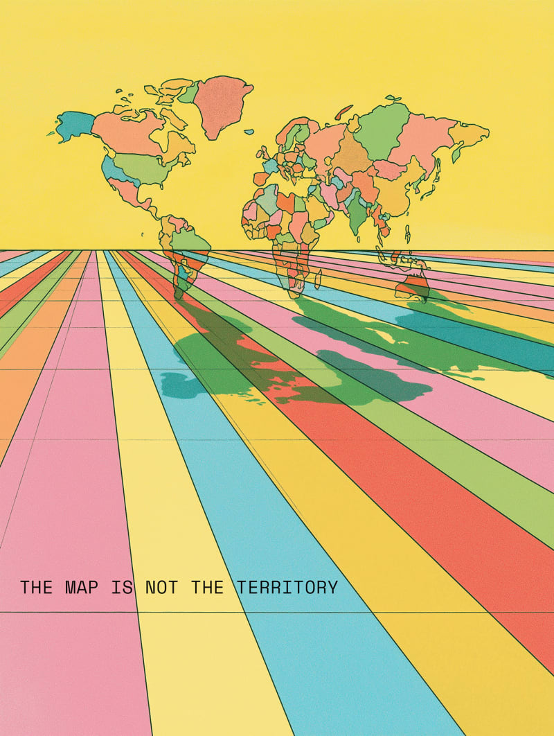
I chose to design for The Map Is Not the Territory because it captures one of the ideas I enjoy most: that our representations of the world quietly shape the way we think about it. Maps feel objective, yet every projection is a series of choices that can distort scale, distance and importance. I wanted to express that visually rather than explain it. At first glance the poster appears to show a familiar world map, but its shadow reveals how easily those same choices can produce entirely different distortions, reminding us that every model is only one interpretation of reality. That feels true not only of cartography but of technology, media, statistics and even our own assumptions.
I also approached it as a flagship image, aiming to establish a recognisable visual signature built around bold, self-contained imagery and generous negative space - this was so the series could work consistently with or without text.
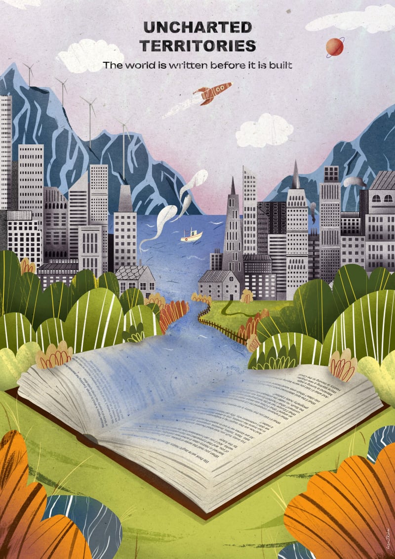
I kept coming back to one simple idea: the world is written before it is built. "Uncharted Territories" is an invitation to imagine the unknown and to explore it. In this illustration, an open book becomes the source of an unfolding world. In the end, this illustration is about human imagination and its integral part in any journey, be it physical or intellectual.
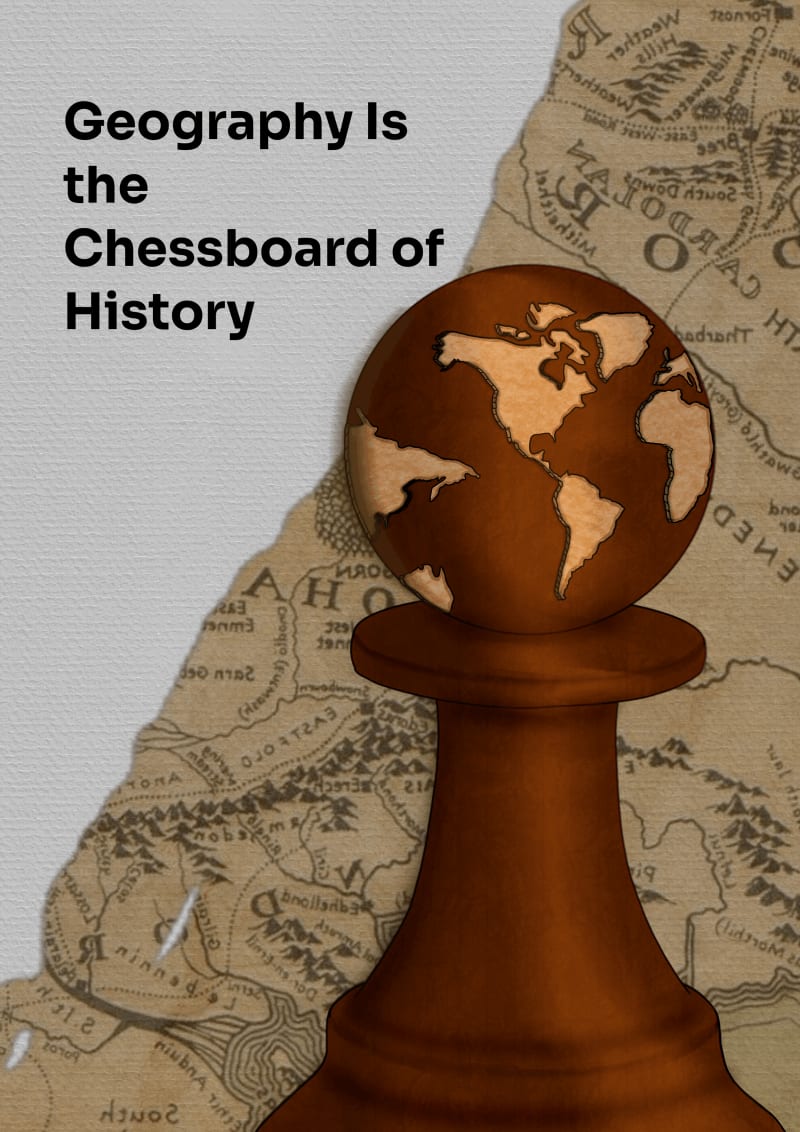
My poster is inspired by “Geography Is the Chessboard of History”, rather than depicting wars, borders, or political leaders, I reduced the article to a single symbolic object, a chess pawn whose head is carved as the Earth. The pawn represents the actors of history, while the engraved globe reminds us that every move is constrained by the terrain beneath it.
While exploring the articles, I noticed that many of the accompanying visuals rely on direct or literal representations of the subject. As a graphic designer, I wanted to approach the article differently. I believe an image can do more than illustrate a concept. It can spark curiosity and encourage people to engage with the content before they even begin reading. That is why I chose to build the poster around an unexpected visual metaphor instead of a literal scene. The chess piece engraved with the world map represents the article’s central idea in a simple but symbolic way. My goal was to create an image that captures attention at first glance, then reveals its meaning as the viewer spends more time with it. I wanted the design to stand on its own as a compelling poster while remaining faithful to the article’s message.
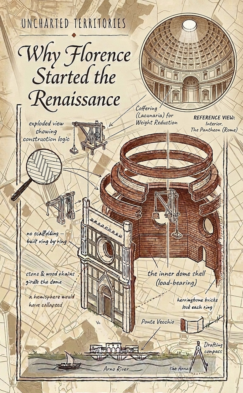
UT articles are layers of complexity, and the images used should be the same. UT articles break a problem apart (or if you will, explode it) to analyse each piece and mechanism - as does this poster. It's a look beyond what's visible to the naked eye, an X-Ray into the complexity of each component and their interaction. I also believe the UT style should be simple, monochrome, with 1 perhaps 2 accent colours, to be reused across tables, diagrams, maps, graphics consistently. Big fan of your work, Thomas.
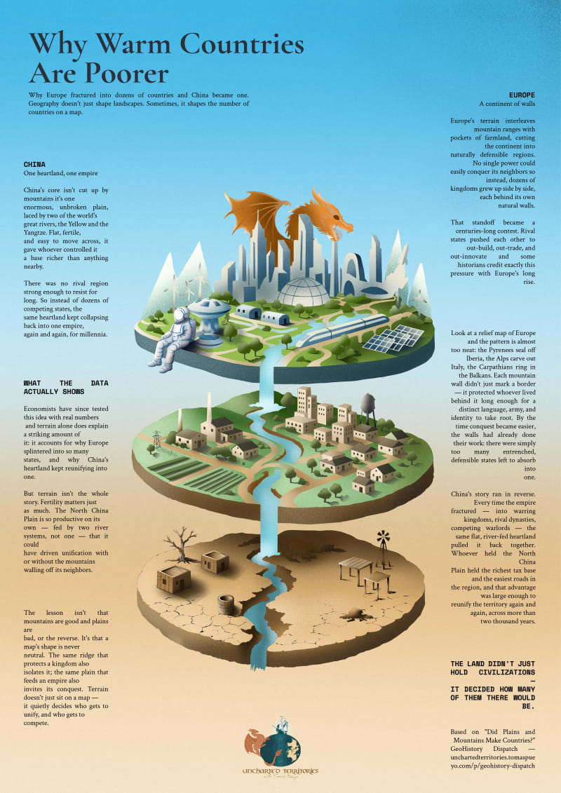
One Plain. Many Mountains. explores why geography, not chance, decided how many countries would grow where. The poster splits into two halves: a mountainous, walled Europe fractured into competing kingdoms, and a single vast, river-fed Chinese plain that kept pulling itself back into one empire. A ship threads Europe's coastlines, dramatizing trade and rivalry; a dragon rises over China's heartland, echoing its imperial symbolism; an astronaut watches from above, tying the piece to Uncharted Territories' recurring cast and its line, "understand the world to navigate the future." At a glance, it's a striking geographic contrast. Look closer, and it reveals the argument: terrain and fertility, not culture or chance, decided who competed and who conquered. Based on the GeoHistory Dispatch.
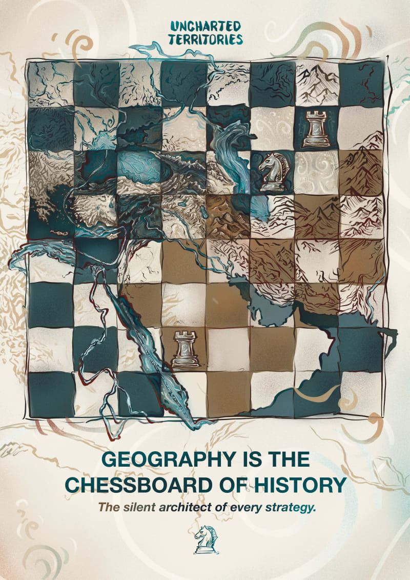
"GEOGRAPHY IS THE CHESSBOARD OF HISTORY: The silent architect of every strategy."
This poster design explores the inevitable bond between physical geography and geopolitical strategy through the metaphor of a chessboard. Blending the rigid structure of a chess grid with the organic, fluid lines of topography, the artwork asserts that mountains, rivers, and strategic passes dictate decisions long before human agency intervenes. Its earthy and aquatic color palette—paired with hand-drawn, tactile brushstrokes—gives the piece the timeless feel of a historical document. Ultimately, the work illustrates that power dynamics, military movements, and borders throughout history are never coincidental, positioning geography as the silent architect behind every strategy.